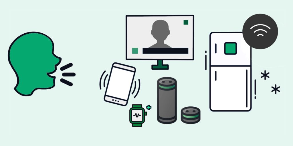
Smart Speaking Across Languages

Are there any issues with translating my voice skill into another language?

Creating voice integrations for large companies with diverse user groups who speak different languages usually means having a conversation about translation. It’s so tempting to take a design created in one language and directly translate it into another language for deployment. Often, well-intentioned arguments about creating consistency for users regardless of their language come into play. To create that consistency, though, we actually can’t do a direct translation. But why not? Why can’t we simply translate one conversation into another?

Semantics

The most obvious reason we can’t just do something like a Google translation on a VUI design is that the specific words you use and the order in which you use them may not translate. Meaning, you can’t do direct one-to-one translation because it will sound like a foreign tourist asking you how to ride the bus to a popular sightseeing destination. It just sounds…off. The whole point of our latest voice platforms and designs is to create natural-sounding conversations that easily engage people without asking them to do mental gymnastics to figure out how to get their tasks completed. When you have an out-of-the-ordinary sentence structure or phrasing, it creates a heavier cognitive load, and people’s brains have to work harder. (Think: “Where to find the library of the city of New York?”) Users already have to work harder in a voice interface than in a screen interface since they have to remember what’s being said as the device speaks to them. Don’t create an interaction that becomes a brain task and a memory game. People will abandon it — or get very frustrated if that interface is their only option.

Culture

So let’s say you address the semantics issue by hiring a translation plus interpretation service. Well done, but you may still need to consider culture. In certain cultures, even if they speak the same language, the culture may be different enough that it may be awkward or inappropriate to use a certain phrase — or even a certain voice — to deliver specific messaging. For example, Portugal’s Portuguese is very formal, and Brazil’s Portuguese is far more colloquial/casual. If you use a Portuguese interpreter/translator, it will be hard to capture the wordplay native to Brazilian Portuguese. If your voice application is meant to be playful, this may prove detrimental.

Likewise, if you are delivering sensitive or personal information (like health information) in a culturally-conservative country, you may have to record the information in either a gender-neutral voice or in male- and female-gendered voices in order to help users feel comfortable hearing it. Otherwise, you may run into issues of people getting offended or shutting off the voice interface because it feels invasive or uncomfortable to them.

Localization

Even if you don’t have to translate from one language to another, you may still need to take localization into account. Language is a reflection of the people within the community you’re speaking to, and inclusivity is part of what makes users continue a conversation. That means you have to contextualize the word choices your VUI speaks and understands to accommodate your users. Whether that means regional dialects or phrasings, or using “lift” in lieu of “elevator” in a UK-based app, it’s important to capture the way your users most commonly speak to make the conversation — and your app — as natural and comfortable as possible. Many companies are launching these conversational applications in order to create an easier interface for their users and build up a rapport they can’t create in a standalone GUI (graphic user interface). Don’t work against that by excluding people’s word choices.

One additional thought about localization and inclusion: much like racial and gender bias in machine learning, we cannot script North American-centric conversations and assume those apply across all cultures and peoples. Not only is that inaccurate and can cause a lack of adoption in particular instances, it’s also harmful to the overall adoption of voice interfaces and people’s enjoyment of them. People use the stuff they like. They talk to people they like. If we’re going to combine the talking and the stuff, it follows that we should make it something they like in order to continue the use of them. Assuming that people either think like you or they’re not worth speaking to is not a good way to get them to like your stuff or your product.

Help from non-VUI team members

By this point, I can imagine you may be thinking, “sure, great, but I don’t have an arsenal of resources at my disposal to do this the ‘right’ way, so I’ll have to do it the realistic way instead.” I get it. It’s not always possible to have a staff of people native to English and the language of choice for your application on your specific team.

But even finding other non-designers or developers to help you test your VUIs is helpful. It makes designing and testing in those languages so much easier to do the same internal prototype and QA testing when you have someone who understands the nuances of both language and social scenarios of conversation to move through the conversation and ensure it feels right as well as is accurate to the original intent. There are even some online tools out there that can allow you to usability test for cheap with people in the language you’re choosing.

What if you have to release a less-than-ideal translation?

We’ve all been there. The timing, the resources, something happens that means a less-than-ideal translation is going to market. In some cases, it may be better than forcing someone who doesn’t speak English to struggle through an interface in a non-native language. But consider the blowback that may occur of providing an excellent experience in one language and a subpar experience in another. You may get away with it for a little bit, or you may not.

One band-aid you can try, if you have to release an imperfect translation, is to acknowledge the imperfection with a line in your greeting. You can try something like, “I’m not the best Tagalog speaker, so bear with me.” Or perhaps you can connect to a human resource to help through crucial moments — IVRs often use this trick. Though, if all your human resources only speak one language, absolutely make sure you let the user know the language will change before handing them off to the human. (I can’t tell you how jarring it is to go through a Spanish-language IVR and be passed off to an English-speaking representative without any advance notice.)

Point being…

Whatever you do, know that conversation is a reflection of the people you’re speaking with, and the same detail and care you pay to craft the conversation in one language should be translated to the next.

Want to learn how Grand Studio can help your next VUI design project and build clarity out of complexity?

We’re here to help!

5 Tips for Maximizing Your Design Overhaul

Maximizing design overhaul

Tackling a big refresh on a product that’s been around for ages is a huge undertaking. In addition to the redesign work, there’s usually a drawn-out diplomacy effort in getting buy-in, organizing the project, and socializing the change. And while most redesigns have popular support or they wouldn’t get the go-ahead, it doesn’t mean that a project won’t have detractors, skeptics, or folks displeased by  the disruptions it generates. Navigating all this requires significant attention and communication, the upshot being that the work — as is often the case with these large-scale efforts — goes far beyond the work itself. 

At Grand Studio, we’ve had the privilege of working with many clients as they tackle big redesigns. Because we know how much legwork it takes, we’re always looking for ways to help our clients economize their efforts and generate bonus benefits from the work  they’re already doing. If you’re on the brink of a big redesign, read on for a few tips on getting more bang for your buck. 

Strategy 1: Leverage the redesign to boost or repair reputation

Many teams, often through no fault of their own, are tasked with managing old tools and products that — to put it delicately — are a little suboptimal on the usability front. This can generate significant reputational damage for the team at the helm. Of course, no one enjoys being on the receiving end of negativity, but this bad reputation also represents a degradation of trust that makes it tangibly harder to get things done within the organization. A product refresh can be a great opportunity to mitigate this reputational harm and put a better foot forward.

For instance, we recently worked with a large medical technology client to refresh an internal purchasing tool that had been causing strain on thousands of employees for years. As part of the redesign, we reached out directly to those most adversely impacted by the tool’s shortcomings. In addition to providing a wealth of information about improvement opportunities, we used these conversations to validate frustrations, provide context on the barriers that had prevented earlier improvements, and demonstrate expertise and commitment to work towards something better. This kind of work helps us to understand how to improve the product while demonstrating a commitment to making our users’ lives better.  

Strategy 2: Be proactive about change management

Even if the redesign ultimately makes everyone’s life easier, change can nonetheless be tricky. This is especially true if your process involves temporary product outages, significant process changes, or a steep learning curve. As such, it can be extremely helpful to communicate proactively and robustly with teams who will be impacted by the redesign, bringing them along with you in the redesign versus simply sending out an FYI when the switch-over happens. 

As in the prior strategy, taking the time to understand a redesign’s implications on various teams and workflows positions you to strengthen the product and build trust and goodwill. Some clients we’ve worked with tell us that the positive communication streams established during a redesign have provided lasting benefits to their organization, impacting projects far beyond the initial collaboration. As designers/researchers, we’re also on the lookout for data communication streams that should stay open past the initial engagement. For example, any metrics we look into for the purpose of the research will likely be incredibly useful mechanisms to measure how a project is doing on an ongoing basis.

Strategy 3: Evaluate the cost/benefits of bringing features in house 

Especially when your organization is just starting off in a new domain, it can really kick-start things to partner with third parties on technology. Instead of taking months to build something in-house, you buy something ready-made and take it for a spin. However, if this third-party tool winds up becoming a big part of your business, there may come a time when it makes more sense to bring it in-house. While the up-front cost of doing so will usually be large, it can de-risk your business from relying too much on third parties, allow you the flexibility to custom-build the product to your exact specifications, and often save you money in the long run.

If your organization has green-lit a design overhaul, it usually means there’s popular support for the product’s utility as a core part of your business. Accordingly, it can be a good time to assess the business case for bringing any related third-party tools in-house. 

Strategy 4: Incorporate forward-thinking process changes

Sometimes, the best time to throw in change is right on top of more change. While it may seem like a terrible idea to incorporate large-scale process changes into a massive redesign, we’ve found that, in most circumstances, the opposite is true.

During a redesign, people’s mindsets are often more expansive, and their ideas are more malleable. As such, it can actually be a prime opportunity to shake up stagnant processes and try out a new way of doing things. Chalk it up to redesign the procedure and test out the new processes you’ve been meaning to socialize, whether it’s a prototyping workshop, a new stream of meetings, or a feedback touchpoint you’ve always thought should exist.

This is particularly likely to be successful if part of your work involves consultants or outside teams — people expect an even higher degree of change when there are newcomers around, especially those acting in a consultative capacity. Loop your consultants into any process changes you feel need to happen so they can support you in advocating for them.

Strategy 5: Take a broad view of KPIs

While you’ll keep your eye on the primary KPIs driving the redesign, there are often secondary or tertiary ways the redesign will have an advantageous effect on the organization. Getting a handle on what these are can add positive internal PR to your project, yielding increased buy-in for this effort and anything else that comes out of your team in the future. 

For example, we once helped a client redesign a tool that was massively confusing users, leading to errors that needed to be found and corrected downstream. Rectifying this user confusion was the primary goal of the project. However, as we got to know the space better, we saw many confused users call an internal support line for help, which cost the client resources.

We talked to the support center to better understand the questions and complaints they received related to the tool, and the redesign subsequently decreased their call volume. Decreasing support call volume wasn’t a main KPI, but it was an extremely welcome bonus outcome that made the project team look better. The more of these side stories you can gather while working on the project, the more your positive PR will disperse, generating buy-in and trust for this project and your next.  

For all the work involved in a redesign, it’s worth the effort to get the maximum benefit possible. For many of those benefits, attending to the softer/more relational side of the work gets added benefits for years. 

As a design and strategy consultancy, Grand Studio specializes in projects that involve not just doing the work but collaborating with you on high-level strategic thinking that can spur positive change within your organization. We know how to use our position as outsiders to support you in diffusing tension, breaking through ossified processes, forming positive new relationships, and workshopping fresh perspectives on chronic problems. 

Have a project you’d like to work together on? We’d love to hear from you.
Effectively Managing Stakeholders Through Uncertain Times.

Facing ambiguity and building clarity with clients

One of the things at Grand Studio we love the most is a good problem to solve. The most exciting problems for us are the elusive, ambiguous, and complex problems packed with the most uncertainty. Indeed, the more challenging the problem, the more rewarding it becomes to solve.

Keeping our clients confident as we move through the rough and tumble of the uncertain problem space and delicately into the solution space in a way that brings delight is a part of what makes our jobs interesting as consultants.

Uncertainty can creep into a project anytime, like a heavy fog resting over a vast valley. Thankfully, we’ve found there are often some common questions that, once answered, can clear the fog and get us all seeing the path again.

What problem are we trying to solve?

Understanding project goals probably sounds obvious, but this becomes more important, especially as new stakeholders enter a project when there’s uncertainty about what we’re doing and why the purpose of a design engagement can become lost.

Something that works well at Grand Studio is a conceptual model that can morph through a project. A model that’s understandable enough for anyone to grasp with a little voice-over so it can bridge any information gaps related to goals and scope.

Another alignment exercise is going through the process of creating strategic principles for a project. These high-level principles are often used to help stakeholders and designers align on what a product should do to satisfy business and user needs. If you and your stakeholders can agree on these, you can reference them in the future to inform your design decisions.

Goals, scope, and principles might shift (hopefully not too dramatically), but at least you will have this tool in your back pocket to help communicate what they are and why.

What do we know or not know?

It’s good to identify early on in a project what information you have and what you need. A lack of information can lead to a situation where you have more questions or assumptions than answers; moments like these can feel overwhelming and can cause unnecessary uncertainty for everyone.

Set time with stakeholders to transfer knowledge and better understand the problem space, identify the questions you still have, and how you plan to answer them. Your stakeholders will likely have questions they wish to have answered as well.

Maintain an inventory of any lingering questions that you have. Over time, you can use these questions to keep a pulse on what you still need to learn. Document answers to those questions and any follow-up questions you might have. The more questions you can find answers to, the better.

Whom do we need to speak with?

Uncertainty runs rampant when we lack information (or worse, misinformation), and there is often a vault of knowledge that someone somewhere has in their heads or a document. Part of a design consultant’s role is facilitating the conversations that need to happen to make that information available.

Interviews with users, experts, or other stakeholders are great ways to gather information and answer questions. In some scenarios, a workshop can be an interactive way to tease out information. We’ve also found that some interviewees respond well to an email or survey with a generic list of questions. It depends on whom you are speaking to and the nature of the information you need.

Invite stakeholders for the ride when you seek information and give them space to ask questions. Giving them space to contribute to the final design of a project can help them feel valued and invested in a solution. If stakeholders cannot participate, regular share-out reports are great ways to keep folks informed about whom we have spoken with, what we have learned, and how these findings impact our designs.

When should we discuss ____ ?

Communication is the secret sauce that ties all this together~ too much of it might inhibit your team’s ability to make progress or annoy your stakeholders. More communication might make your stakeholders comfortable, uncertain, or out of the loop. Setting expectations and working relationships early on can help facilitate this balance.

Uncertainty can creep in fast when there’s a lack of communication or poor communication. No communication at all can be damaging to a relationship. A stakeholder might urgently want to discuss something- perhaps a significant change at their organization, a change in requirements, or a new strategic initiative- so opening space for those conversations is essential to ensuring everyone is on the same page.

Stay flexible, remain transparent about what communication styles are working or not, and tinker accordingly.

How should we deal with change?

At some point during a project, you might find that the goals have changed, you have new stakeholders, your requirements have changed, or your communication cadence needs to be fixed. Often, change becomes associated with uncertainty.

Things will change during a project, and being flexible enough to adapt to those changes with the right strategy is a big part of successful consulting. Be transparent with your stakeholders about changes affecting the project objectives and scope. Have fun with change and find ways to spin it into new opportunities.

Have fun!

Make your relationship with your client a partnership–keep it collaborative and interactive and ask questions. Make spending time with your team the highlight of their week!

Want to learn how Grand Studio can help your next project and build clarity out of complexity?

We’re here to help!

What Big Financial Institutions Can Learn From Fintech

Fintech is on the rise, expected to reach $700 billion in market size by 2030. Customers increasingly want to do things digitally, and they expect increasingly sophisticated tools to support them. The pandemic era catalyzed this shift, incentivizing more of the population to try things online that they might have done in person. The result is a customer base rapidly gaining comfort and savvy in managing their wealth digitally. 

But while fresh-on-the-market fintech start-ups may be able to keep pace with these fast-growing customer demands, it’s more challenging (and more expensive) for large financial institutions with decades of infrastructure to react similarly. This has led to a steep decline in customer satisfaction across most digital banking services, particularly in the area of mobile apps.

Large financial institutions can’t (and shouldn’t) look exactly like fintech. They’re different organizations with different goals, and it’s important to note that the very longevity that makes it harder to be agile is also a bank’s greatest asset: it represents an invaluable, decades-long track record of responsibility with people’s financial futures. That said, there are some lessons established orgs can carry over from fintech as they work to upgrade their customer experience. Read on for Grand Studio’s take on four trends worth considering at your organization.

Trend 1: Biometric Authentication

Money is emotional, and banks have long since understood the need to give clients a sense of safety and security with their assets. But what people view as “secure” in the digital world can vary widely from person to person. Furthermore, there’s a spectrum of what people are willing to exchange for that security — is it worth this extra step? Is it worth fishing out an account number I may not have memorized? In our fast-paced world, time delays can be a huge hindrance. 

Something with the potential to hit the marks on both security and convenience is biometric authentication. People are gaining more comfort using their faces and fingerprints to log in, and body parts aren’t typically something you accidentally leave in a file cabinet. If research shows that your customer base is ready to accept biometric authentication on its own or as part of 2FA, it’s worth looking into as a way to get high ratings on trust and security without compromising ease. 

That said, it’s important to think through exactly how additional security layers should work for different customers because everyone has a different definition of what convenience means in the context of security. Some customers may feel most comfortable with one-time passcodes, while others may feel best with text verification or even a phone call. Designing and building out these various pathways can add up, so it’s helpful to get a handle on what it will involve up-front.

Trend 2: API Integration With Other FinTech Products

More and more, people expect their mobile banking apps to integrate with other products and services they use — including other banks. Some believe that designing these connection points may lose them business by making it too easy to use other fintech tools or transfer money out of their accounts. Accordingly, they may deprioritize API integration features and even build elements that contain people within their ecosystem of services. But increasingly, this turns clients off. If your suite of features don’t reflect your customer’s lifestyle, they may search for another bank whose app does.

Isolated banking services are simply not the reality for today’s clients. People often have their money in several different places, and use several different tools for budgeting, investing, and more. An app that’s vacuum-sealed at the edges will frustrate customers by not meeting them where they are. On the other hand, designing smooth ways for people to bank in ways that reflect the interconnectedness of their lives can build a more positive relationship, creating a sense that you understand how their lives work and want to support them. The freedom you offer them can help you retain them better than digital blockades.

Trend 3: AI Nudges For Better Financial Decision-Making

The percentage of people in the US who consider themselves financially healthy is dropping. People want and need support to make better decisions that maximize what they have, and set them up for a more secure future. Leveraging AI within a mobile banking app can allow you to provide smart notifications and personalized offers to your customers, helping them make good financial choices at the right time in a way that meets their goals. These nudges and coaching features can not only improve their satisfaction and goodwill towards the bank, it can also generate revenue by selling them on products and services that are a good fit for their needs. 

Of course, not all AI is created equal. To benefit customers, AI features must truly support their needs, and come across as helpful and intelligent — not intrusive, annoying, or creepy. To use AI to the best of its ability, start by deeply understanding what your customers want and need to improve their financial lives. Then, use the tech power in service of those aims. 

Trend 4: Interfaceless Experiences

With the proliferation of smart speakers and chatbots, people are getting more comfortable with “interfaceless” UIs that rely less on visuals and buttons and more on digitized conversation. Many fintech companies have discovered that, for certain mobile banking tasks, a quick digital chat is the smoothest and most efficient customer experience. This solution is usually a better fit for fairly straightforward, everyday transactions. A chat-based option for a simple task is more often seen as a perk, while a chat-based option for a complex task is at risk of being seen as a subpar customer experience. 

It’s also wise to consider where your chatbot would pick up the baton in a customer’s journey and where it would hand it off to other services, like a human expert. This helps customers feel that their issues are being properly handled by those with the best skills for the job and imbues the bot with a sense of purpose and value. As always, it’s important to research your customer base to understand where these experiences may add meaningful support versus leaving a sour taste. 

While valuable in the right use cases, interfaceless UIs may not fit every institution. For banks with a client base who is just beginning their journey into mobile banking, it may feel like too big of a leap. Once again, researching your client base will help you understand if this would add meaningful value and is the right investment for your organization at this point in time.

The Bottom Line

Financial service providers have a big mandate ahead of them to level up their digital experience amid rapidly rising customer expectations. There’s a lot to learn from fintech’s focused digital experiences that can be translated more widely across the industry. However, every organization’s path to improvement is going to be unique. Each institution comes with its own infrastructure, its own vision, its own compliance needs, and, importantly, its own unique client base. This means there’s no one-size-fits-all template for improvement, and a new feature or slate of high-impact ideas at one organization could flop at another. The best way to start is by gaining a deep and holistic picture of your organization and customers to identify the biggest leverage points for positive change. That way, you don’t risk investing time and money into tools that will only gather digital dust.

At Grand Studio, we’ve had the privilege of working with many financial institutions on the path to achieving their north-star visions. While we have developed many repeatable approaches and can recognize a variety of similar scenarios across these institutions, we also know the value of tailoring our approach to fit our client’s specific needs. We specialize in discovering what is unique about each organization and its customer base. We then assist our clients in prioritizing the best way forward with high-impact change while honoring and maintaining what they do best.

Got a digital banking project you’d like to collaborate on? 

We’d love to hear from you!

How to Score a Rewarding Digital Experience for Sports Fans

Which group of users can provide us with more excitement, passion, and raw emotion other than the wide world of sports? Very few areas of leisure and entertainment feature people pacing around in their living rooms, yelling at a television. Sports fans are simply a different breed altogether. They are deeply connected to the game, the athletes, and the storylines.

Therefore, designing a great digital experience that puts your product (or service) above the competition takes real care for your fans and their unique needs.

Start with “why”

Sports fans have tons of outlets already, digital and otherwise, to follow their favorite sports. You may be part of an organization looking to disrupt the competition for select offerings or a company looking to maintain your lead in the market. Getting the digital project off and running is the first step, and it begins with constructing an argument for what success looks like from a business standpoint. Is it to generate more revenue opportunities? Reach a new fan base? Encourage deeper engagement from fans with your product? Likely there are a few goals in mind. What is important is to stay true to why this project deserves the investment from stakeholders around you. Be sure to provide critical success factors and look to measure them throughout your process to know you’re on track towards real business value.

Embody the audience

The sports field presents a relatively easy, low-cost way of learning about these users — go be a sports fan! Discuss with folks in your company about which audiences make up your intended user base and go research them. Visit sports bars or arenas and talk to fans, invite them to participate in surveys, use friends and family, or experience being a fan yourself through the course of the season. When learning the finer details of a new sport, my favorite method is to turn to video games: there is a rhyme and reason for how the creators have constructed gameplay, the stats that show up, the game-break content, and of course, learning the rules of the game. If broadcast television is available (or we are in season), that is another perfect reference for good ideas. Finally, consider a longer study with sports fans — what does an average week of following sports look like vs. the during-game experience? Where are there moments of real excitement? Or pain? How are fans experiencing that with digital products? You will likely come up with various fan types you could be designing for, and the next step is to prioritize them accordingly.

Narrow the focus

Too many teams get caught up in wanting to “design for everybody”…or designing for the “ultimate fan” at the expense of ignoring the rest of the field. In the design process, this leads to endless meetings asking “what-if” questions. If your team has done its homework on fans, and understands what excites them and what challenges them — there are usually a few representative types to choose from for your product/service. They can be based on various dimensions, be it fan avidity, geography, or tech savviness to name a few. We typically create personas for our clients to base our decisions on, but whether these user types are defined by an in-house team or a specialized team, the point here is to select a few user types that become your target fans. How do you select? Go back to starting with why: which ones will best help your team accomplish its goals for the business? Do you need to design for all these users in the first version? Probably not. Pick the ones that have the greatest potential to accomplish your team’s goals and when you head to the concept phase, be sure to design from their inspiration.

Choose key scenarios

After selecting your target users, ensure you’ve placed them in the right scenarios. Your fans’ specific journeys with your product are vital in moving quickly through the design process. Again, the point isn’t to design for everybody…in every situation, the goal is to design the very best experience for the fans that will drive business value. These are strategic choices which means they should not be obvious yet be intentional. Every fan is going to want an “intuitive” experience. Perhaps only the handful of target fans will want an experience that selects and notifies them of close games across the league to pull them into the drama.

And, of course, fans could use various products in combination over the course of following a season or even a single game, so where is the right place for yours to come in? Choose those fan journeys that lead back to your goals. Are you designing for the fan that is following one favorite team? Multiple teams? Is your fan sitting in the airport killing time by opening your app? Are they watching the game with family at home? Are they in a sports bar? When will they use your product? How will they use it? In sports, fans experience a roller coaster of emotions leading up to a game, during a game, and immediately after. Break down those moments for prime design exploration.

Generate concepts

Having set your target fans and journeys, it’s time to start concepting new ideas. Invite other teammates to sketch with you! But be sure you are prompting those sketches with the appropriate target fans and their journeys. At this point, some design teams forget all you’ve done to get to this point. You know the fans you want to reach. You know their challenges to solve. Design artifacts like personas don’t have much value unless you use them to generate concepts. We like to print out big posters of our target fans to put around the room, complete with their goals, journeys, and pain points. You want the team to concentrate on how the product or service solves the needs of these target fans in those key moments. Use those fans as a lens by which you prioritize the concepts you want to develop further. This helps to avoid designing for everybody — this keeps the conversation squarely focused on user-centered design: your target fans.

The best part about concepting for sports fans is that ideas do not necessarily have to solve moments of pain and frustration. While you will undoubtedly run into solutions that do indeed solve pain and create more convenience, this is a chance to look for areas of delight and build excitement to increase better engagement.

Borrow from the best

No doubt that digital sports products and services can be a crowded space, from dedicated apps and sites to third parties that are providing access to games (like Twitter, YouTube, and Amazon). Everyone has their spin on a great user experience. Understand what others are doing so that your product has a chance to get noticed. I also believe in borrowing patterns from competitors that encourage good behavior. The classic YouTube app behavior allows users to watch a video (now a live game) and browse for other content simultaneously. This is a great example of handling multitasking if that is one of your goals for target fans. In addition, there are plenty of digital products outside of the sports industry that are solving very similar challenges. Take a look to see what else is out there, and don’t be afraid of creating new patterns yourself.

Create a regular cycle of testing

Make it a habit of testing new ideas with target fans, even in sketching form — sports fans will definitely tell you how they feel and what they need. It’s up to you to interpret that into actionable next steps in your design process. As you develop these concepts into higher fidelity, whether they be wireframes, visual design mockups, or even prototypes — keep testing them with target fans. It costs much less to do a quick test than to release a product that falls short of expectations. In addition, you will have more fuel for proving your product goals along the way.

With other industries and professions, often the toughest challenge is gaining access to truly understand the needs of users and embody them through our design process. But in sports, understanding the fan experience for digital products and services could not be easier. The key is to wrap those learnings around a process proving tangible value over time. The opportunities to design more rewarding experiences for fans continue to grow as technology improves. It’s up to us as designers to blend these technological advances with real user delight to push the organization to new heights.

Want to learn how Grand Studio can help with your next project and build clarity out of complexity?

We’re here to help!

Using Voice Interfaces in Emotionally-Fraught Industries

We’ve had the pleasure (and pain) of working in several high-stakes industries like healthcare and finance, and one truth rings out across any high-stakes scenario: people get super emotional. Unsurprisingly, they particularly get emotional when it comes to their life or livelihood. However, it’s interesting to note that, from a product design perspective, we don’t often address those user emotional states in our design. But the market is begging for emotional help. As an example, in finances, 62% of the growing market says that money is a stressor and 87% of them claim feelings as the reason they don’t talk about it.

(Hello, opportunity gap!)

At this point, you might say to yourself: OK. I could address this gap in any number of channels, but if 87% just said they don’t want to talk about it, why would I consider a channel whose entire interface is a conversation? The secret here is wrapped up in a 2014 study done by the University of Southern California. Researchers brought in about 200 people to interact with a therapy bot they’d built and divided them up into two groups: one which was told the bot was entirely automated with no human interaction or oversight and another which was told the bot was semi-automated and a human would be operating it remotely. The participants who thought they were talking to just the bot were far more likely to open up and reveal their deeper, true feelings.

What we learn from this and other research similar to this, particularly in the mental health and addiction spaces, is that people see bots as a “safe space” where they can share ideas and feelings without fear of judgment or bias perceived in human interactions.

Tips for Creating a Successful Emotional VUI Experience

How do we create a successful voice experience in an industry we know to be highly emotional for our users? Well, particularly if it’s your first foray into the space, focusing on bringing user emotions to the forefront in 3 key areas will get you most of the way there.

1. Scope. Knowing what makes for a good use case in voice (and what doesn’t) is key to using the channel to its strength and getting customers to adopt the experience. It is also key to ensuring you’re using voice in the best way for a stressful situation.

For example, let’s say you have a user who runs 20 pet stores around the 5 boroughs of New York and is constantly in their car visiting all their locations. User research may tell you that they are quietly panicking and getting increasingly stressed out with staying up-to-date with profit-and-loss sheets but don’t have the time or ability to in-depth review a bunch of spreadsheets, particularly when they’re out on the road. A voice experience addressing emotions in finance here might look like a skill that eases concern and builds confidence by pulling the data for a particular pet store location which they can access in the car while on their way to that location. A health bot that has thoroughly scoped where they will and won’t help is Woebot, a behavioral, cognitive therapy bot for people who need some extra emotional support.

Woebot’s initial interaction (from their website)

2. Context. You can’t design for emotions without knowing the emotional context of your users, so the best way to understand this is with in-person user research (methods like contextual inquiry, ethnography, etc.). As you gather your data, plot it out in a journey — even better if you can co-build this with your user. Include the order of operations, methods for making decisions or taking actions, and the feelings people have in each moment.

Example of mapping with emotional context

Analyze what’s happening around the moments that create the emotions and ask people where they wish they’d have a guide or friend to talk them through. By doing this, you can identify both areas where things are going well, and you can potentially replicate areas where more support is needed. The Wolters Kluwer/Emmi Diabetes Support system is an example of a multimodal voice experience that handles user emotional context really well. (Bias alert! I was on the team that created that system.)

3. Interactions: Tone Consistency. In voice experiences, the interactions are the words and behaviors from both the system and the user. At the point of scripting and designing these interactions, it’s important to bring in your marketing team, UX writers, content strategists, and anyone else in the organization who may be communicating with your users. It’s imperative that you have a unified voice in the tone and words you’re using in print and in audio. Having multiple speakers or personas creates confusion for users on who your brand is and the values you represent in a good state. The more emotional people become, the less patience they have for confusion and the more abandonment you’ll see.

3a. Interactions: Applying Context to Words. It’s also important to apply the emotional context you learned about in the user research to your interactions, which in voice, is mostly about the words you use. For example, if you learn that people filing a life insurance claim only do so when someone close to them has passed away, incorporate that emotional context into an automated call center you might design in that space. Seems obvious, but you’d be surprised at how many times that kind of sympathy is left behind. Addressing your users with just a bit of compassion and acknowledgment of their emotional context goes a long way in both calming your user’s negative emotions as well as distinguishing your brand as one that truly understands and cares.

Addressing All Emotional States

There are plenty of emotional scenarios in everyday life. You don’t have to address every single one that might possibly come up — and honestly, you shouldn’t. There are scenarios that humans are simply better at handling than bots (for example, you don’t want a bot giving financial guidance and advice — the emotional landmines alone are too nuanced for a bot to handle). And that’s OK. When there are nuanced or complex scenarios that we simply don’t have the technological or design prowess to handle yet, leave it to a person. The idea behind automating with voice and chat is to assist in easier transactions or in situations where a human interaction could impede the experience or information needed, not to make every single conversation automated.

For those use cases you do tackle, doing some research into the general emotional context of your users’ journeys, planning for those emotions in your language and behaviors of your interactions, and acknowledging emotional context creates an experience that people trust and want to return to.

Want to learn how you can successfully navigate a voice experience in an emotional landscape?

Establishing a Successful Design Practice

Design-led businesses like Apple have been inspirational throughout the business and design worlds as an effective way to enhance customer relationships by understanding their needs and advancing business goals.

However, the road to truly-integrated design practices and operations within an organization can be messy and put at risk by “let’s just do it how we’ve done it before”s and “not now”s. 

While there can be many ways to establish a successful human-centered design practice at large and small organizations, we’ve curated a few of our favorite methods from our work to successfully set up design practices in large multinational companies.

  1. Start small. It is tempting to jump out of the gate with a large, keystone project that can make your name in the company. But typically, we’ve seen that the stakes are too high for others in the organization to be willing to trust a new process – or a new leader – to do the proper work of human-centered design. Instead, starting with a focused, specific project that can be accomplished quickly is a great way to prove what design can do. It gives stakeholders a chance to understand the process and see its benefits while keeping things nimble enough for you and your team to turn things around quickly, showcasing the value of design before people have a chance to object or worry about it deviating from previous processes. And starting with something small allows you to showcase the importance of incremental launch and learning, particularly for those companies still working in a waterfall methodology. Choosing a project that can make a small but meaningful impact, perhaps like an internal-facing project that alleviates a lot of pain for employees but doesn’t demand a lot of budget or resources, can be a great initiative to tackle before jumping into initiatives with higher stakes, larger budgets, and more people involved.
  1. Involve other departments. The one thing design absolutely cannot be within an organization is political. That said, larger, hierarchical organizations often have interpersonal politics baked into their culture due to the size of the business. But keeping in mind that this isn’t a land grab will help you approach other stakeholders who may feel threatened or affected by any new process. Often this could be Product, Marketing, Engineering, or anyone else who may have had to pick up the slack without Design being around yet. By building bridges and inviting people into the process through kick-offs, stakeholder interviews, design reviews, research sessions, and concepting workshops, you can give other departments the comfort of knowing that they have resources to help them achieve their goals without feeling like they’ll be shut out of the new process altogether. This also provides space for them to share how parallel work streams may impact your collective efforts and gives you a chance to garner buy-in and allies as you move through the process.
  1. Oversharing is caring. Going along with involving people, it’s essential to remember that this may be a new process for your stakeholders and collaborators. It’s essential to keep them looped in, likely more than you think. Having transparency in the process is a great way to build trust and get folks to understand how the sausage is made without having to take up time on their busy calendars. It also helps people feel like they’re part of the process and can ask questions when they need clarification.
  1. Listen to the business.  We all want to succeed in our work, particularly when we’re in the first round and want to prove our value. But don’t let perfect be the enemy of good. Remember that you’re running a long con when setting up a design practice, and you must build trust first and foremost. Listening to people – to their needs, concerns, and ideas – and working those into your process and solutions will go a long way to building the trust needed to expand the design’s reach and capabilities. But you need to be genuine and consider what the business is saying. Sometimes that means the design won’t be as crisp or evolved as you’d like it to be. That’s OK. It’s about progress, not perfection. A little bit of research is better than no research. A dated filtering system in the digital tool is better than no filters at all. Give yourself some leeway to work within your constraints, and know that the more you connect with the business, the more they will trust you to connect to the users. (All of this within reason, of course – there are always times when you need to stand up for the users, but you can still negotiate with the business when you’re listening to them elsewhere and connecting their concerns to what you’re hearing from users.)

There is always the temptation to go hard, go fast and show what design can do going full-force. But if your organization is still new to the process, we recommend starting with these steps first to ensure a more prosperous, long-term relationship.

Want to learn more about how to establish a successful design practice in your organization? 

We’re here to help!

De-Risking Software Investment with Usability Testing

By now, most of us have interacted with a doctor or nurse via video. COVID’s increased demands on medical professionals, combined with the need to prevent community transmission wherever possible, have accelerated an already-developing practice in the delivery of medical care: remote patient monitoring, or RPM.

Clinicians are presented with many technical service options designed to help bridge this “white space” between office visits. Grand Studio recently helped a large hospital network evaluate RPM vendor candidates for their RFI process, and usability testing offered an important set of criteria for this evaluation.

An emerging technology with profound usability implications

Care delivery modalities are often dependent on comprehension and adoption from both clinicians and patients, and our client understood this before we even had to suggest it. 

Clinicians can find themselves short on time and presented with a long list of biometric data to quickly assess and address. They may be accessing this data during busy clinic hours or between surgical procedures. Missing or misunderstanding something important can have serious implications for the patient’s wellbeing. Good interfaces will amplify clinician focus and mitigate their fatigue.

Patients may be familiar with digital technologies in general. Still, their ability to learn new interaction modes might be challenging when focusing their attention on coping with a health condition, especially a condition that may be new to them. Also, because many of these applications reside on a smartphone, it’s fair to assume that patients will be distracted when interacting with these interfaces.

We knew that context of use for all users would be critically important for our RPM solution. We decided that ranking the offerings against foundational and accepted usability rubrics would allow us to objectively assess how patients and clinicians might interact with this technology. These rankings would provide the decision-makers with a non-biased set of acceptance criteria to consider when choosing a technology partner.

Step 1: Measure for fundamental heuristics

The market for RPM solutions is large and varied. As with any technology industry sector, some products are more mature than others. Additionally, some solutions were removed from consideration due to no fault of their own – they may be too narrow in their utility, too difficult to integrate with sibling platforms, or too general in their functionality.

We were presented with a collection of eleven vendor demo videos to evaluate. Grading on a curve, we scored their clinician-facing dashboards on commonly-accepted foundational rubrics.

  • Orientation, context, & wayfinding: How easy is it for users to find what they’re looking for?
  • Visual hierarchy & module differentiation: Is it clear that some things are more important than others?
  • System feedback/confirmation of action: Does the software validate the user’s actions?
  • Constructive failure & mistake recovery: What happens when a mistake is made? Is it easy to correct?
  • Affordances & interaction cues: Are interactive elements intuitive?
  • Language & terminology: Does the system present commonly accepted terms?
  • Three of the eleven scored very well, four were well below average, three were unacceptable, and one of the vendors was dismissed for other reasons.

Step 2: Test the finalists with real users

Testing software with real users is an essential part of any usability evaluation. No matter how much research you do and how deep your professional expertise is, you’ll never be able to consider real people’s comprehension patterns and work habits.

To simulate a real clinical scenario, we collaborated with our clinical partners to create a “dummy” data set with 100 fictional patient records. Each patient was given hypothetical biometric readings for blood pressure, blood glucose level, heart rate, respiration rate, weight, fall detection, and SPO2. We also mapped these patients to a small selection of conditions such as congestive heart failure, diabetes, and hypertension. Finally, each patient was assigned to one of eight doctors and one of five monitoring nurses.

The vendors were given these datasets, and the three finalists were asked to stand up a “sandbox” environment to support our task observation exercises.

With the help of four monitoring nurses and one care coordinator, we asked these testers to execute a series of tasks within each finalist platform. Watching these users closely and interviewing them for feedback after completing the tasks yielded interesting and clear results.

The dashboards were evaluated on both general and feature-specific sets of heuristic criteria, allowing for some overlap with the first round of scoring. We measured the systems for the following feature-specific heuristics:

  • Dashboard clarity: Are the contents of the clinician dashboard presented in a scannable way?
  • Dashboard filter sets: Can the user reduce and refine the contents in the dashboard in an intuitive and content-relevant way?
  • Patient details: Are these details clear and contextual, presenting the clinician with both a single measurement and trending data presentation?
  • Alert clearing & documentation: How easy is it to clear and document the clinical details when a patient’s biometrics are out of range?
  • Patient contact: Does the application provide functionality that enables text, phone, or video contact with the patient?
  • Clinician contact & collaboration: Does the platform support secure patient information sharing when a patient case requires escalation to a physician or collaboration with a nursing peer?
  • We also evaluated each of these offerings from a patient point of view, emphasizing program onboarding and user comprehension. 
  • Onboarding & guidance: Is the patient provided a clear and easy-to-use introduction to the software?
  • Next-best action clarity: As with clinicians, many of the patient’s tasks need to happen in sequence. Is that sequence clear?
  • Troubleshooting & support: How does the platform support users encountering technical challenges?
  • Biometric reading context: Patients are often confused by their biometric readings. Does the interface provide helpful context for understanding this information?
  • Wayfinding & signage: Is functionality clearly marked?
  • System feedback, reminder cues, & task validation: Patients also need confirmation of their actions in the application. They may also need scheduled reminders to take biometric readings. Is this functionality clear and flexible?
  • Clinician interaction functionality: Does the system provide a means of interaction between the patient and the clinician?
  • Physical space needed for devices: How much physical space does the kit take up? 
  • Portability of devices: Are the kit devices easy to carry, or is moving them challenging?
  • Device consistency & ease of connectivity: Do the kit devices and interfaces feel like they’re part of a suite of products? How easy is it to connect them with each other, personal smartphones, and the web?

Findings: One vendor scored much higher than the others

Remote Patient Monitoring offers a great example of the value of human-centered design. Each of the platforms we evaluated is built around technologies unavailable only a few years ago, technologies that will fundamentally change how healthcare is delivered in the near future. Many of the systems we evaluated failed to deliver that technology effectively because the interface and product design did not adequately support the real people, clinicians, and patients, who would use these new tools.

Given these stakes, the role of usability testing was elevated in prominence. The testing results were clear – one of the eleven vendors stood out as a clear favorite.

While the usability testing was only one important piece of the vendor evaluation process, it ensured that user needs were considered, helping to facilitate onboarding and adoption as a result.

The Power of Building Emotional Intelligence into Banking Experiences

Money is one of the most powerful drivers of decision-making in society. There are people who devote most of their lives to acquiring, growing, and keeping money. Money, by nature, is emotional to people at multiple stages in their lives. So when Grand Studio is looking to build products and services around something that touches the very core of people, it’s imperative on us to understand the emotional connections that exist there, as well as the responsibility we have to respond in kind. Whether we are designing products for personal banking, investments, or brand-new fintech opportunities, building up the emotional intelligence in our products can create stronger, more meaningful connections with customers, leading to long-term success for the brand.

What does it mean to have emotionally intelligent products?

Products and services with a high degree of emotional intelligence are ones that are born from an understanding of customer pain points (the inputs) and deliver solutions that spark more optimistic outcomes for customers (the outputs). They do not need to be overly complex nor hyper-personalized experiences to start. However, they do a fine job at easing pains, providing guidance when needed, offering options, and creating moments of delight. This is about creating empathy for our audiences and providing solutions to address their needs.

Banking on positive attitudes

The experiences we create in consumer banking need to feel tailor-fit for where consumers are in their financial journey in order to create those meaningful connections. Your audience might be afraid of low balances, trapped by debt, confused about saving, frustrated at small tasks like trying to wire someone else money, or looking for new opportunities to grow their wealth. Any of these scenarios point to pains that our solutions can address, but we can do so with a friendly experience. In the end, we are looking to help customers create the right type of changes in their financial lives that puts them on the path toward greater confidence.

Measuring emotional intelligence

It might seem difficult at first to connect user emotions to your existing products. A helpful activity I’ve found is to conduct field research to understand where your product is contributing to good feelings or perhaps may be falling short. Talk to your customers, get perspective on what your product is doing and how that makes them feel given their financial goals. This spectrum can help your customers identify where your product currently stands:

Grand Studio’s EI spectrum

This diagram sits on the spectrum of emotional states (based on optimism vs. pessimism) as well as the level of control afforded to users (full control vs. no control). If your product comes with a high sense of emotional intelligence, it would pass through areas of optimistic emotion for users. It will solve problems that hit users at their core, it will make them feel respected and delighted, and at best it can truly motivate them to behave in their own best interests.

Where do most products and services fit in?

The majority of products and services generally scratch the surface of gaining customer loyalty (represented by the bell curve). It all comes back to emotional intelligence, which understands what the product can provide, where the user is in their journey, and how a set of features can drive good behavior and positive feelings. To get to aspirational places like surprise, delight, and motivational — it requires extra focus on the combination of offerings and convenience that solve real needs for users. All of this creates long term engagement and customer loyalty.

What if these products fall short?

If however your product fails to inspire people, if it actually causes frustration and deterrence, then it is at risk of abandonment by your customer base. I would expect users to describe the impact of your product toward the bottom half of the spectrum:

Products that fall down here in the bell curve are generally met with indifference or considered not useful enough. The value proposition either doesn’t match the individual (wrong audience) or it doesn’t solve a real need (wrong value). This is often met with emotions like frustration, anxiety, and mistrust. In financial services, this can have very grave consequences when handling a customer’s money. This is often seen in support tickets and complaints. Fees for example are a big-ticket item. Inconveniencing the customer. Mishandling money. Timeliness. Any of these could easily propel a customer to switch to your competitor.

Measuring emotions leads to a plan with momentum

While most products that fail to connect generally fall into a zone of customer indifference or doubt, it’s helpful to get a reality check on where your product stands and ultimately determine how far you need to move your audience to get to a place of higher emotional intelligence.

This can create a roadmap for you in terms of where you are starting with your customers to gain their trust. From there, it is helpful to continue a cycle of customer learning as you provide solutions and test if they are generating the right emotional resonance with your audience.

How to build emotional intelligence into products

This is all about becoming aware of the potential impacts your product has on its audience and managing that responsibility appropriately. Fintech products today often try to do too much and could benefit from more focus in areas that create the right type of emotional responses from customers. There are several key areas to consider when creating a more rewarding user experience:

Start with the audience you have

Designing for everyone creates too much pressure to please everyone. In the world of finance, we need to be extra careful about not turning away customers and look to create experiences that inspire optimism. This starts with identifying your current audience before branching out to acquire a new one.

Find the value

This one is absolutely key. Do some quantitative and qualitative research with your audience to know more about their financial journeys, where there are common patterns, and what features could actually solve their problems — turning frustration and anxiety into more confidence-building emotions. Have them evaluate your current product along the emotional intelligence spectrum above. We want to ensure that your potential solutions can solve real needs for them.

Provide the right balance of user control

There is no right formula here as to what level of control will give users the confidence they need to feel financially secure and confident to conduct activities on your platform. This is something that needs to be tested and evaluated often to ensure you are receiving the right emotional responses from your audience. Perhaps there are parts of your experience you want to remove control and create more discovery, leading to surprise. Products that do this well often experiment with rewards and game-like experiences to keep users engaged.

Delight customers whenever you can

The nice, little touches can add up to big impacts for experience. Spend the extra effort to make users feel great about paying off a balance, successfully transferring money, or taking ownership over their financial future. Make it fun to interact with your product.

All that said, it’s worth considering your organization’s brand and tone. Messaging is just as important, so your products should have the ability to fit into the ecosystem of your other products and services, whether they be online, offline or a combination.

Which products are doing this well?

Venmo

Now owned by PayPal, Venmo became the juggernaut it is today because it stuck to a narrow focus and didn’t try to do everything all at once. On the surface it was seen as a new wave of social money transfer and it really spoke to a slice of the demographic pool ready to embrace mobile-first. If we peel back further we know that it certainly does one thing particularly well — it can connect to virtually any bank and transfer money fast to your friends. No longer did users have to figure out the costs of external transfers from their bank’s websites. Venmo created a wealth of convenience up front but spoke to its user base in a way that made money transfer fun. Not only did it ease pains and frustrations, but it promoted itself as entertaining. This is a clear example of an offering that aims to eliminate frustrating experiences while the way it is designed creates moments of pure delight. Who knew that sharing burrito emojis in a FinTech app could be so satisfying?

Mint

Now owned by Intuit, Mint was one of the first online platforms to become an aggregator for retail banking data — realizing that their target audience had accounts across multiple banks and investment firms, they streamlined all of that into one secure experience to allow users to track the flow of money and stay on top of their financial futures. Where there was initially confusion, doubt, and anxiety came clarity and motivation to take control over transactions and spend history. Over time Mint has slowly added to its capabilities by assessing user needs and responding to them accordingly, like the addition of budget tracking and financial goals. The platform achieved focus, built a critical mass, and delivered a delightful experience.

Digit

Digit is an interesting pick because it doesn’t have a traditional user interface. It started a few years ago as a conversational interface or chatbot. But you could talk to that chatbot like a friend or an assistant to move around money between your checking account and your rainy day fund. The platform’s secret sauce is that it monitors your spending habits and automatically transfers funds to the rainy day account without you noticing the dip in your account. It periodically sends you text messages to let you know how much you’ve saved on occasion and does so with a delightful attitude. Users were shocked at how much they ended up saving in a short amount of time without having to think about an optimal strategy. Machine learning did that all for them.

Credit Karma

Credit Karma was one of the first real players to truly open up credit score information to individuals without trapping them in a subscription payment cycle. Not only do they provide excellent information as to reasons why scores may have gone up or down over time but they provide helpful recommendations of which credit cards a customer may be eligible to pursue. The larger banks have now adopted the ability to check credit scores but Credit Karma was one of the first to solve for feelings of confusion and doubt in their customers.

Chime

With similarities to the banking app Simple before it, Chime is looking to upend traditional banking competitors by offering a one-stop solution for mobile banking. This has been tried many times before in the past decade yet Chime seems to be breaking through right now. They are reaping the benefits of acquiring new customers due to some long held friction by more traditional banks — like account fees. Promising no fees is just the start for them. They are also taking advantage of financial automation for saving money, ability to send payments to anybody (like Venmo), and celebrating paydays for their users. To top it off, they are relentless about protecting user privacy, data, and giving users control to freeze their account should they lose their debit card. This all translates into a seamless experience for the average customer: creating feelings of security, confidence, and motivation to continue a true partnership with Chime.

Consumer banking continues to be emotional

In the world of finance — creating empathy for customers, meeting them where they are at in their journey, and celebrating the good times are all key to creating brand loyalty with our products and services. It’s important for us to not forget that money is indeed emotional, and our customers view their situations differently because everyone is on their own journey and have financial goals that are deeply personal.

When we are looking to revamp existing experiences or to create entirely new ones, it’s important that we consider how we want people to feel while using our products. We want to make sure we are laying the groundwork for a true partnership between the company and its customers. Transforming your process to be more user-centric and opting to build emotional intelligence will undoubtedly give you the right framework to measure success. Doing so upfront will be the best investment your company makes, an investment in its customers, so that everyone moves forward on the right path.

Want to learn how Grand Studio can help with your next project and build clarity out of complexity?

We’re here to help!

Scaling Research Through Templates

How to create a tool kit for your team to do consistent, scalable research.

User research is one of those things that every company knows they need. Where it gets confusing is how to do it, especially if you don’t have a dedicated person or team. There are many methodologies, and it can be hard to know when to use which one and how. Of course, hiring a UX Researcher is one of the better ways to sort through all of this. But your budget, team philosophy, or location constraints may prevent a staff researcher from being the right solution for you. One option is to create a starter toolkit for your team to align everyone who’s doing research and to keep your methods consistent, efficient, and scalable. But what should you include in this kit?

A Checklist for Testing

Aligning and setting expectations before testing helps the research stay on course even if a number of people take turns conducting the research. Having one single document that walks you through everything from scoping and defining research goals, to the day of testing, to what to do after testing (and everything along the way) is a great way to hold someone’s hand when you can’t be there physically. Including details on when to do what (like 2 days before the scheduled sessions) and references to other tools or documents — like consent forms or tech troubleshooting — will be useful here as well.

Templates

Speaking of consent forms, it makes the process much easier if you have 1 or 2 templates that you can use for testing depending on how you’re capturing feedback. For example, are you just recording the participant’s voice, or are you also capturing their movements on a screen? Is it a video interview? When you don’t need to hunt for the right kind of document, rely on your clients or vendors, or rewrite it each time, the setup process becomes smoother, and you can focus on what really matters — the research.

Tech Setup

Depending on the kind of testing you’ll be doing, you’ll need a document that walks you step-by-step through what you need to do for each piece of technology or software you’ll be using. Do not rely on manuals, message boards, or the facilitator’s knowledge. Assume your grandma will be leading the session and screenshot or photograph everything. Then test it out on several different people who might be using this software to ensure it’s clear and that there aren’t any other logistics to consider. For example, you might discover that participants need to download the software prior to the session and will need extra instructions or that your team needs a certain password to access the software. Better to know and account for these needs ahead of time than run into an issue during the session itself.

Stakeholder Documents

For anyone who’s not intimately involved in the setup or facilitation of the research but who still wants to be involved, it’ll be helpful to have documents that can be sent in advance. This will help keep them in the loop with what to expect and offer ways in which they can help. Documents that are helpful include: FAQs for what to expect in a session, capturing feedback in a way that will be useful to the person synthesizing the work, and templates for sharing out any insights.

Always More to Do

Obviously, you can go more in-depth than this, but having a starter toolkit in place will give you a good place to scale up research for your team. As with anything in design, iteration is key.

Want to learn how Grand Studio can help with your next project and build clarity out of complexity?

We’re here to help!