De-Risking Software Investment with Usability Testing

By now, most of us have interacted with a doctor or nurse via video. COVID’s increased demands on medical professionals, combined with the need to prevent community transmission wherever possible, have accelerated an already-developing practice in the delivery of medical care: remote patient monitoring, or RPM.

Clinicians are presented with many technical service options designed to help bridge this “white space” between office visits. Grand Studio recently helped a large hospital network evaluate RPM vendor candidates for their RFI process, and usability testing offered an important set of criteria for this evaluation.

An emerging technology with profound usability implications

Care delivery modalities are often dependent on comprehension and adoption from both clinicians and patients, and our client understood this before we even had to suggest it. 

Clinicians can find themselves short on time and presented with a long list of biometric data to quickly assess and address. They may be accessing this data during busy clinic hours or between surgical procedures. Missing or misunderstanding something important can have serious implications for the patient’s wellbeing. Good interfaces will amplify clinician focus and mitigate their fatigue.

Patients may be familiar with digital technologies in general. Still, their ability to learn new interaction modes might be challenging when focusing their attention on coping with a health condition, especially a condition that may be new to them. Also, because many of these applications reside on a smartphone, it’s fair to assume that patients will be distracted when interacting with these interfaces.

We knew that context of use for all users would be critically important for our RPM solution. We decided that ranking the offerings against foundational and accepted usability rubrics would allow us to objectively assess how patients and clinicians might interact with this technology. These rankings would provide the decision-makers with a non-biased set of acceptance criteria to consider when choosing a technology partner.

Step 1: Measure for fundamental heuristics

The market for RPM solutions is large and varied. As with any technology industry sector, some products are more mature than others. Additionally, some solutions were removed from consideration due to no fault of their own – they may be too narrow in their utility, too difficult to integrate with sibling platforms, or too general in their functionality.

We were presented with a collection of eleven vendor demo videos to evaluate. Grading on a curve, we scored their clinician-facing dashboards on commonly-accepted foundational rubrics.

  • Orientation, context, & wayfinding: How easy is it for users to find what they’re looking for?
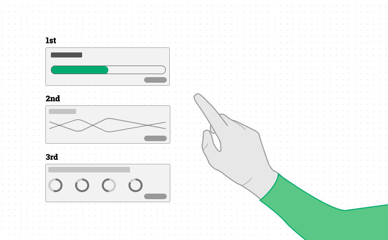
  • Visual hierarchy & module differentiation: Is it clear that some things are more important than others?
  • System feedback/confirmation of action: Does the software validate the user’s actions?
  • Constructive failure & mistake recovery: What happens when a mistake is made? Is it easy to correct?
  • Affordances & interaction cues: Are interactive elements intuitive?
  • Language & terminology: Does the system present commonly accepted terms?
  • Three of the eleven scored very well, four were well below average, three were unacceptable, and one of the vendors was dismissed for other reasons.

Step 2: Test the finalists with real users

Testing software with real users is an essential part of any usability evaluation. No matter how much research you do and how deep your professional expertise is, you’ll never be able to consider real people’s comprehension patterns and work habits.

To simulate a real clinical scenario, we collaborated with our clinical partners to create a “dummy” data set with 100 fictional patient records. Each patient was given hypothetical biometric readings for blood pressure, blood glucose level, heart rate, respiration rate, weight, fall detection, and SPO2. We also mapped these patients to a small selection of conditions such as congestive heart failure, diabetes, and hypertension. Finally, each patient was assigned to one of eight doctors and one of five monitoring nurses.

The vendors were given these datasets, and the three finalists were asked to stand up a “sandbox” environment to support our task observation exercises.

With the help of four monitoring nurses and one care coordinator, we asked these testers to execute a series of tasks within each finalist platform. Watching these users closely and interviewing them for feedback after completing the tasks yielded interesting and clear results.

The dashboards were evaluated on both general and feature-specific sets of heuristic criteria, allowing for some overlap with the first round of scoring. We measured the systems for the following feature-specific heuristics:

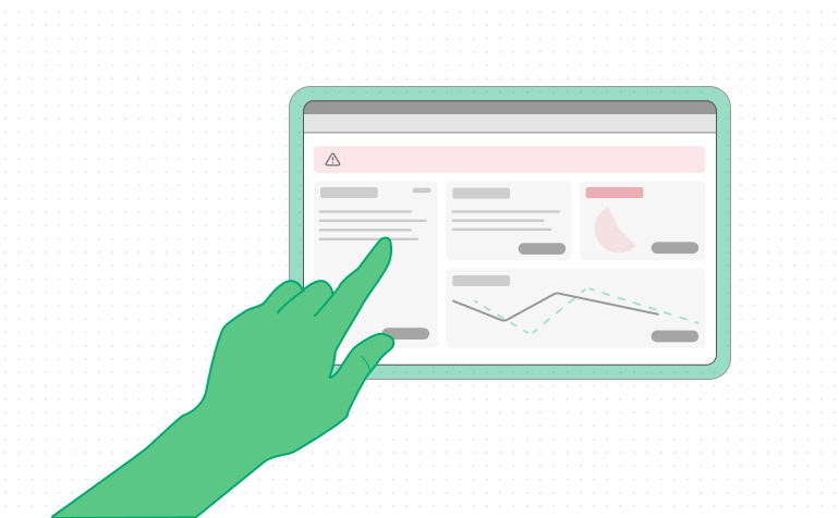
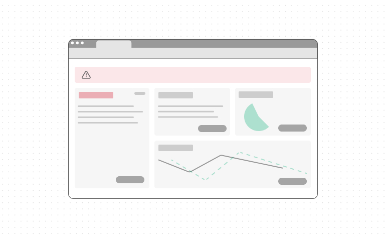
  • Dashboard clarity: Are the contents of the clinician dashboard presented in a scannable way?
  • Dashboard filter sets: Can the user reduce and refine the contents in the dashboard in an intuitive and content-relevant way?
  • Patient details: Are these details clear and contextual, presenting the clinician with both a single measurement and trending data presentation?
  • Alert clearing & documentation: How easy is it to clear and document the clinical details when a patient’s biometrics are out of range?
  • Patient contact: Does the application provide functionality that enables text, phone, or video contact with the patient?
  • Clinician contact & collaboration: Does the platform support secure patient information sharing when a patient case requires escalation to a physician or collaboration with a nursing peer?
  • We also evaluated each of these offerings from a patient point of view, emphasizing program onboarding and user comprehension. 
  • Onboarding & guidance: Is the patient provided a clear and easy-to-use introduction to the software?
  • Next-best action clarity: As with clinicians, many of the patient’s tasks need to happen in sequence. Is that sequence clear?
  • Troubleshooting & support: How does the platform support users encountering technical challenges?
  • Biometric reading context: Patients are often confused by their biometric readings. Does the interface provide helpful context for understanding this information?
  • Wayfinding & signage: Is functionality clearly marked?
  • System feedback, reminder cues, & task validation: Patients also need confirmation of their actions in the application. They may also need scheduled reminders to take biometric readings. Is this functionality clear and flexible?
  • Clinician interaction functionality: Does the system provide a means of interaction between the patient and the clinician?
  • Physical space needed for devices: How much physical space does the kit take up? 
  • Portability of devices: Are the kit devices easy to carry, or is moving them challenging?
  • Device consistency & ease of connectivity: Do the kit devices and interfaces feel like they’re part of a suite of products? How easy is it to connect them with each other, personal smartphones, and the web?

Findings: One vendor scored much higher than the others

Remote Patient Monitoring offers a great example of the value of human-centered design. Each of the platforms we evaluated is built around technologies unavailable only a few years ago, technologies that will fundamentally change how healthcare is delivered in the near future. Many of the systems we evaluated failed to deliver that technology effectively because the interface and product design did not adequately support the real people, clinicians, and patients, who would use these new tools.

Given these stakes, the role of usability testing was elevated in prominence. The testing results were clear – one of the eleven vendors stood out as a clear favorite.

While the usability testing was only one important piece of the vendor evaluation process, it ensured that user needs were considered, helping to facilitate onboarding and adoption as a result.

The Power of Building Emotional Intelligence into Banking Experiences

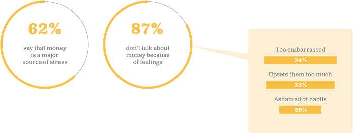
Money is one of the most powerful drivers of decision-making in society. There are people who devote most of their lives to acquiring, growing, and keeping money. Money, by nature, is emotional to people at multiple stages in their lives. So when Grand Studio is looking to build products and services around something that touches the very core of people, it’s imperative on us to understand the emotional connections that exist there, as well as the responsibility we have to respond in kind. Whether we are designing products for personal banking, investments, or brand-new fintech opportunities, building up the emotional intelligence in our products can create stronger, more meaningful connections with customers, leading to long-term success for the brand.

What does it mean to have emotionally intelligent products?

Products and services with a high degree of emotional intelligence are ones that are born from an understanding of customer pain points (the inputs) and deliver solutions that spark more optimistic outcomes for customers (the outputs). They do not need to be overly complex nor hyper-personalized experiences to start. However, they do a fine job at easing pains, providing guidance when needed, offering options, and creating moments of delight. This is about creating empathy for our audiences and providing solutions to address their needs.

Banking on positive attitudes

The experiences we create in consumer banking need to feel tailor-fit for where consumers are in their financial journey in order to create those meaningful connections. Your audience might be afraid of low balances, trapped by debt, confused about saving, frustrated at small tasks like trying to wire someone else money, or looking for new opportunities to grow their wealth. Any of these scenarios point to pains that our solutions can address, but we can do so with a friendly experience. In the end, we are looking to help customers create the right type of changes in their financial lives that puts them on the path toward greater confidence.

Measuring emotional intelligence

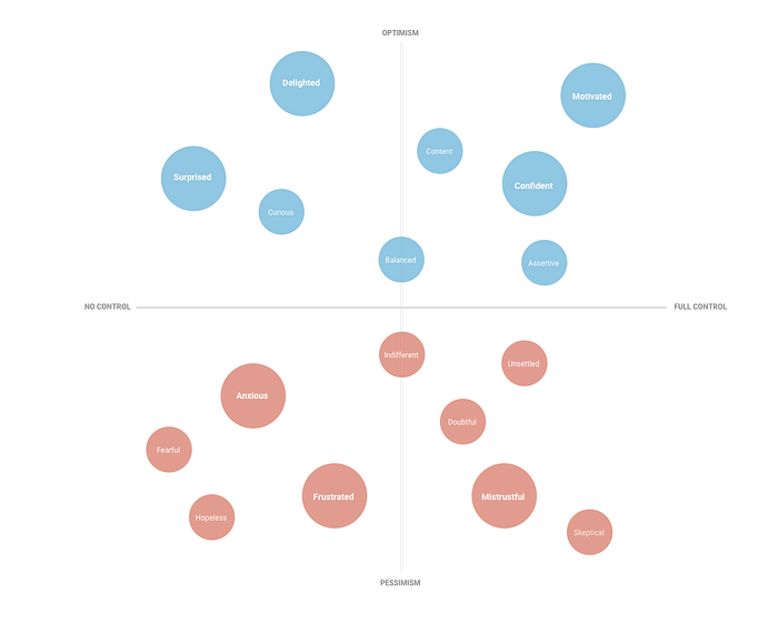
It might seem difficult at first to connect user emotions to your existing products. A helpful activity I’ve found is to conduct field research to understand where your product is contributing to good feelings or perhaps may be falling short. Talk to your customers, get perspective on what your product is doing and how that makes them feel given their financial goals. This spectrum can help your customers identify where your product currently stands:

Grand Studio’s EI spectrum

This diagram sits on the spectrum of emotional states (based on optimism vs. pessimism) as well as the level of control afforded to users (full control vs. no control). If your product comes with a high sense of emotional intelligence, it would pass through areas of optimistic emotion for users. It will solve problems that hit users at their core, it will make them feel respected and delighted, and at best it can truly motivate them to behave in their own best interests.

Where do most products and services fit in?

The majority of products and services generally scratch the surface of gaining customer loyalty (represented by the bell curve). It all comes back to emotional intelligence, which understands what the product can provide, where the user is in their journey, and how a set of features can drive good behavior and positive feelings. To get to aspirational places like surprise, delight, and motivational — it requires extra focus on the combination of offerings and convenience that solve real needs for users. All of this creates long term engagement and customer loyalty.

What if these products fall short?

If however your product fails to inspire people, if it actually causes frustration and deterrence, then it is at risk of abandonment by your customer base. I would expect users to describe the impact of your product toward the bottom half of the spectrum:

Products that fall down here in the bell curve are generally met with indifference or considered not useful enough. The value proposition either doesn’t match the individual (wrong audience) or it doesn’t solve a real need (wrong value). This is often met with emotions like frustration, anxiety, and mistrust. In financial services, this can have very grave consequences when handling a customer’s money. This is often seen in support tickets and complaints. Fees for example are a big-ticket item. Inconveniencing the customer. Mishandling money. Timeliness. Any of these could easily propel a customer to switch to your competitor.

Measuring emotions leads to a plan with momentum

While most products that fail to connect generally fall into a zone of customer indifference or doubt, it’s helpful to get a reality check on where your product stands and ultimately determine how far you need to move your audience to get to a place of higher emotional intelligence.

This can create a roadmap for you in terms of where you are starting with your customers to gain their trust. From there, it is helpful to continue a cycle of customer learning as you provide solutions and test if they are generating the right emotional resonance with your audience.

How to build emotional intelligence into products

This is all about becoming aware of the potential impacts your product has on its audience and managing that responsibility appropriately. Fintech products today often try to do too much and could benefit from more focus in areas that create the right type of emotional responses from customers. There are several key areas to consider when creating a more rewarding user experience:

Start with the audience you have

Designing for everyone creates too much pressure to please everyone. In the world of finance, we need to be extra careful about not turning away customers and look to create experiences that inspire optimism. This starts with identifying your current audience before branching out to acquire a new one.

Find the value

This one is absolutely key. Do some quantitative and qualitative research with your audience to know more about their financial journeys, where there are common patterns, and what features could actually solve their problems — turning frustration and anxiety into more confidence-building emotions. Have them evaluate your current product along the emotional intelligence spectrum above. We want to ensure that your potential solutions can solve real needs for them.

Provide the right balance of user control

There is no right formula here as to what level of control will give users the confidence they need to feel financially secure and confident to conduct activities on your platform. This is something that needs to be tested and evaluated often to ensure you are receiving the right emotional responses from your audience. Perhaps there are parts of your experience you want to remove control and create more discovery, leading to surprise. Products that do this well often experiment with rewards and game-like experiences to keep users engaged.

Delight customers whenever you can

The nice, little touches can add up to big impacts for experience. Spend the extra effort to make users feel great about paying off a balance, successfully transferring money, or taking ownership over their financial future. Make it fun to interact with your product.

All that said, it’s worth considering your organization’s brand and tone. Messaging is just as important, so your products should have the ability to fit into the ecosystem of your other products and services, whether they be online, offline or a combination.

Which products are doing this well?

Venmo

Now owned by PayPal, Venmo became the juggernaut it is today because it stuck to a narrow focus and didn’t try to do everything all at once. On the surface it was seen as a new wave of social money transfer and it really spoke to a slice of the demographic pool ready to embrace mobile-first. If we peel back further we know that it certainly does one thing particularly well — it can connect to virtually any bank and transfer money fast to your friends. No longer did users have to figure out the costs of external transfers from their bank’s websites. Venmo created a wealth of convenience up front but spoke to its user base in a way that made money transfer fun. Not only did it ease pains and frustrations, but it promoted itself as entertaining. This is a clear example of an offering that aims to eliminate frustrating experiences while the way it is designed creates moments of pure delight. Who knew that sharing burrito emojis in a FinTech app could be so satisfying?

Mint

Now owned by Intuit, Mint was one of the first online platforms to become an aggregator for retail banking data — realizing that their target audience had accounts across multiple banks and investment firms, they streamlined all of that into one secure experience to allow users to track the flow of money and stay on top of their financial futures. Where there was initially confusion, doubt, and anxiety came clarity and motivation to take control over transactions and spend history. Over time Mint has slowly added to its capabilities by assessing user needs and responding to them accordingly, like the addition of budget tracking and financial goals. The platform achieved focus, built a critical mass, and delivered a delightful experience.

Digit

Digit is an interesting pick because it doesn’t have a traditional user interface. It started a few years ago as a conversational interface or chatbot. But you could talk to that chatbot like a friend or an assistant to move around money between your checking account and your rainy day fund. The platform’s secret sauce is that it monitors your spending habits and automatically transfers funds to the rainy day account without you noticing the dip in your account. It periodically sends you text messages to let you know how much you’ve saved on occasion and does so with a delightful attitude. Users were shocked at how much they ended up saving in a short amount of time without having to think about an optimal strategy. Machine learning did that all for them.

Credit Karma

Credit Karma was one of the first real players to truly open up credit score information to individuals without trapping them in a subscription payment cycle. Not only do they provide excellent information as to reasons why scores may have gone up or down over time but they provide helpful recommendations of which credit cards a customer may be eligible to pursue. The larger banks have now adopted the ability to check credit scores but Credit Karma was one of the first to solve for feelings of confusion and doubt in their customers.

Chime

With similarities to the banking app Simple before it, Chime is looking to upend traditional banking competitors by offering a one-stop solution for mobile banking. This has been tried many times before in the past decade yet Chime seems to be breaking through right now. They are reaping the benefits of acquiring new customers due to some long held friction by more traditional banks — like account fees. Promising no fees is just the start for them. They are also taking advantage of financial automation for saving money, ability to send payments to anybody (like Venmo), and celebrating paydays for their users. To top it off, they are relentless about protecting user privacy, data, and giving users control to freeze their account should they lose their debit card. This all translates into a seamless experience for the average customer: creating feelings of security, confidence, and motivation to continue a true partnership with Chime.

Consumer banking continues to be emotional

In the world of finance — creating empathy for customers, meeting them where they are at in their journey, and celebrating the good times are all key to creating brand loyalty with our products and services. It’s important for us to not forget that money is indeed emotional, and our customers view their situations differently because everyone is on their own journey and have financial goals that are deeply personal.

When we are looking to revamp existing experiences or to create entirely new ones, it’s important that we consider how we want people to feel while using our products. We want to make sure we are laying the groundwork for a true partnership between the company and its customers. Transforming your process to be more user-centric and opting to build emotional intelligence will undoubtedly give you the right framework to measure success. Doing so upfront will be the best investment your company makes, an investment in its customers, so that everyone moves forward on the right path.

Want to learn how Grand Studio can help with your next project and build clarity out of complexity?

We’re here to help!

Scaling Research Through Templates

How to create a tool kit for your team to do consistent, scalable research.

User research is one of those things that every company knows they need. Where it gets confusing is how to do it, especially if you don’t have a dedicated person or team. There are many methodologies, and it can be hard to know when to use which one and how. Of course, hiring a UX Researcher is one of the better ways to sort through all of this. But your budget, team philosophy, or location constraints may prevent a staff researcher from being the right solution for you. One option is to create a starter toolkit for your team to align everyone who’s doing research and to keep your methods consistent, efficient, and scalable. But what should you include in this kit?

A Checklist for Testing

Aligning and setting expectations before testing helps the research stay on course even if a number of people take turns conducting the research. Having one single document that walks you through everything from scoping and defining research goals, to the day of testing, to what to do after testing (and everything along the way) is a great way to hold someone’s hand when you can’t be there physically. Including details on when to do what (like 2 days before the scheduled sessions) and references to other tools or documents — like consent forms or tech troubleshooting — will be useful here as well.

Templates

Speaking of consent forms, it makes the process much easier if you have 1 or 2 templates that you can use for testing depending on how you’re capturing feedback. For example, are you just recording the participant’s voice, or are you also capturing their movements on a screen? Is it a video interview? When you don’t need to hunt for the right kind of document, rely on your clients or vendors, or rewrite it each time, the setup process becomes smoother, and you can focus on what really matters — the research.

Tech Setup

Depending on the kind of testing you’ll be doing, you’ll need a document that walks you step-by-step through what you need to do for each piece of technology or software you’ll be using. Do not rely on manuals, message boards, or the facilitator’s knowledge. Assume your grandma will be leading the session and screenshot or photograph everything. Then test it out on several different people who might be using this software to ensure it’s clear and that there aren’t any other logistics to consider. For example, you might discover that participants need to download the software prior to the session and will need extra instructions or that your team needs a certain password to access the software. Better to know and account for these needs ahead of time than run into an issue during the session itself.

Stakeholder Documents

For anyone who’s not intimately involved in the setup or facilitation of the research but who still wants to be involved, it’ll be helpful to have documents that can be sent in advance. This will help keep them in the loop with what to expect and offer ways in which they can help. Documents that are helpful include: FAQs for what to expect in a session, capturing feedback in a way that will be useful to the person synthesizing the work, and templates for sharing out any insights.

Always More to Do

Obviously, you can go more in-depth than this, but having a starter toolkit in place will give you a good place to scale up research for your team. As with anything in design, iteration is key.

Want to learn how Grand Studio can help with your next project and build clarity out of complexity?

We’re here to help!

3 Tips for a Successful Conversational Banking Bot

In the banking and financial services industry, where interactions may be urgent and require a degree of emotional nuance, it’s important to provide customers with customer service that is helpful and available whenever and wherever they need them. Given that this can be tough to scale with human resources, many institutions have turned to chatbots to help support their customer service. 

However, as with any technology, it’s important to keep in mind that these bots can both help and harm your reputation with customers. So how do you do it right? We recommend a few key pillars to help ensure your chatbot can assist customers both in the way they need and in a way the bot can succeed.

3 Key Pillars to Creating a Successful Banking Bot

1. Focus on straightforward tasks

In general, chatbots are helpful when the task they are asked to handle can be easily interpreted and accessed by technology. For example, something like “what’s my account balance” is very straightforward. (There may need to be an authentication moment and potentially a clarification of which account if the customer has more than one, but generally, this is a task that is well-understood by a bot and has data that is easily accessible by most back-ends to pull and provide.) 

A customer request like “what should I invest in today” requires more nuance and interpretation of data than most chatbot systems can provide today (and many banking legal teams would not feel comfortable broaching that kind of topic in a bot). For a question like this, it’s worth forwarding the request directly to a human, who may have more experience, context, and knowledge to appropriately answer that question for the specific customer asking it.

And that leads right into our second tip…

2. Have a human option at the ready

One thing many customers detest is getting caught in a loop that they can’t get out of, particularly when they can’t successfully complete their task in said loop. Think about being on a phone call with an automated system. Perhaps you were calling specifically because you wanted to talk things through with someone. The nature of your call may be pretty straightforward or it might be nuanced, but if you called, it’s because you needed someone to talk it through. 

In the context of banking, oftentimes customers call because the stakes feel – and may actually be – high, and the heightened emotions from those stakes require a human’s involvement. Allowing customers the option to access a human in that channel and interaction (whether it’s a chat or phone call), particularly if their question is not resolvable by the system because it’s more complex or because the system isn’t parsing them well, is crucial to people feeling like the institution actually cares about resolving their issue. 

So don’t kick them over to a phone call if they’re in a chat, and don’t make them run into five error messages before you offer the transfer to a human. Consider the optimal experience for that user in that heightened state, and give them options to resolve their problem both in the channel they’re in and with the expedience that the presence of a bot suggests.

3. Don’t get cute 

Speaking of heightened emotional states and high stakes, something your customers are almost never going to have patience for in this context is joking, cutesy language, or overly personifying your bot. Some actionable personality traits are important. For example, is this bot a subservient assistant relying on the human for all inputs and directives, or is it an expert who proactively offers guidance at the risk of “knowing more” than the human it’s serving? 

However, doling out a tidbit like the bot’s favorite Victorian author is not helpful in the context of someone trying to access account information. Keep the cutesy bits to yourself and keep the dialog focused and concise.

Banking Chatbots in Real Life

While we’ve worked on creating banking bots, our NDAs prevent us from discussing the details publicly. That said, there are some excellent bots in the financial field, and we’re fans of these two in particular: Eno at Capital One and Erica at Bank of America. 

Both of these chatbots do a good job of processing customers’ requests and handling the simple tasks that they’re designed to do.

Eno from Capital One

Eno is focused around security measures, such as spending habits outside of the norm, as well as sharing useful insights on ways to reduce spending. 

Overall, this chatbot mimics a privacy and fraud outreach service and successfully rides the line of feeling personable and not robotic. Eno is available across a range of channels, including mobile apps, desktop web browsers, email, smartwatches, text messages, and phone push notifications.

Erica from Bank of America

Erica is billed as a powerful virtual assistant that helps you stay on top of your finances. It provides services like alerts around duplicate charges, monitoring of recurring charges and increases, and updates on monthly spending.

This chatbot provides a lot of strategic value, even suggesting personalized tactics for BoA customers to improve their finances – but notably, Erica also includes an option to refer users to a specialist.

Getting the Financial Conversation Started 

Quality chatbots can serve your customers while also saving your employees valuable time by removing the need for them to address repetitive queries, so they can focus on high-value interactions instead. But remember, current chatbots aren’t designed to replace human agents –  rather, offload and scale straightforward tasks and requests and provide your customers with around-the-clock service.

Fortunately, at Grand Studio, our team includes one of the foremost experts on conversation design. That means we can help you implement one or more chatbots in your financial business to boost customer engagement, improve retention, and grow your bottom line. 

Want to learn how Grand Studio can help with your next project and build clarity out of complexity?

We’re here to help!

3 Essential Tips for Quality Digital Experience Design

Everyone wants a product that customers love and use. Often, a business comes up with an idea, product, and development to get it out the door, and then…it just sits there. What gives?

There may be several things at play, but crafting an intentional and thoughtful Digital experience plays a key role in shaping your product’s adoption and stickiness.

To help you, we’ve pulled together Grand Studio’s top 3 digital experience design tips to make your digital product an experience success story. 

Tip 1: Do Your Research – Don’t Assume

The tricky part about experience design is that you can’t automatically know what the experience is like for your customers. Putting yourself in their shoes can be difficult, especially when you’re hard at work on it and inevitably become too close to have an objective view.

The fix for this is to conduct research into how customers engage with your digital product. It’s easy to make assumptions, but doing so can cause you to miss essential details that dramatically improve your customers’ experience. 

As you begin the process of redesigning a digital product, there are a few things you can do to start understanding your customers’ experience: experience testing, competitive analysis, and customer interviews.

Experience Testing

Experience testing is a great way to get to know an existing digital product or experience if you’re new to it.  It boils down to this: Go through the experience of being your own customer, if possible. While it won’t give you insight into what your customers need and want, this hands-on approach will provide you with a more in-depth understanding of what the digital experience is currently like

Competitive Analysis

The other typical, often-overlooked research method is competitive analysis, which is essentially experience testing for your competitors’ products. 

A detailed competitor audit provides valuable insights into the features that customers may expect within the landscape. It can help you understand what might be helpful in your product’s digital experience. 

Customer Interviews

Customer interviews are another key avenue for research. After all, one of the most straightforward ways to gather information on customer experience is to interview some of your existing customers and walk through the digital experience together, discussing what it’s like to use your product and engage with your business.

Tip 2: Define Your Priorities

After you gather some initial data from the research phase, it’s time for a design phase where you analyze your results and come up with a plan on what to change and when.

The problem is that no company has unlimited resources and bandwidth to make changes all at once – and even if you did have them in theory, you still need to adjust the digital experience with deliberateness and gauge the success of your changes over time. 

Ultimately, this means you’ll have to prioritize your changes to the digital experience.

To determine your next priorities, we find a joint assessment assessing of feasibility, impact, and speed of each potential change can help prioritize already defined-as-desired changes from your customers.

Feasibility

First, consider the feasibility of a proposed change. An idea may seem beneficial, but can it be accomplished? Do you have the resources, institutional knowledge, and wherewithal to implement the idea? 

Impact

Next, consider the impact of a proposed change. Will this change satisfy the desired change surfaced from customers – and to what extent? 

It’s important to consider your entire list of priorities and pinpoint the specific changes that will have the most significant positive effect on customer experience. 

Speed of implementation

Lastly, consider the potential speed of a proposed change. Are there any changes you can make within days or weeks rather than months or years? 

In a perfect world, you could come up with at least a few priorities that are feasible, high-impact, and quick to deploy – but in the real world, you’re more likely to have a combination of lower-impact but faster ideas, as well as higher-impact but slower ideas. 

While it is tempting to use speed as the reigning criteria on what should get addressed first, it can be helpful to tackle both a quick and lengthier solution from the start so you have something meaningful for people as soon as possible while you work on something perhaps more impactful that will take a bit more time. 

Tip 3: Continue Testing and Iterating

As you’ll read about in our client case study below, we recommend at least two rounds of research, design, prototyping, and testing. The idea is to implement changes and assess the results of the digital experience, then go back and either refine what worked or start over with new ideas.

It’s important to note that the ideal digital experience is a moving target. Even after you’ve designed and deployed a quality digital experience, you’ll want to keep testing and iterating to ensure it’s keeping pace with customer expectations,  one of the big reasons why digital experience design is never a one-and-done prospect. 

Case in Point: Improving Digital Experience for a Food Service App

To illustrate these digital experience redesign principles in action, let’s take a quick look at what Grand Studio did for one of our clients. 

We were tasked with creating a better customer service experience for our food service industry client’s digital app because, as we learned, there wasn’t an efficient way for customers to get information around specific ordering issues. 

This was one of the most significant pain points that the client’s customers had, but we only discovered this through two extensive rounds of research. 

Case Study Results: 

In the first round, we realized that customers wanted a more transparent feel from experience and the ability to communicate with the brand more directly. The major obstacle here was a customer service phone number hidden behind generic FAQs that obscured the ability to get efficient customer support.

Beyond simply a problem of interface and navigation, the hidden phone number was an issue that damaged brand trust – and without changes, this could deter new customers and lead to loss of customer loyalty among existing customers. Both of these were incredibly corrosive to the business.

Ultimately, we determined what was and wasn’t working and gave our client near-term solutions to roll out over the next couple of months. The focus was on discoverability, navigation, and the information structure of the app. 

We also created a future-forward path, based on the feasibility of the technical side, to hone in on real-time support options we could implement to transform the customer experience for our client’s app.

Ultimately, the digital experience is a multifaceted challenge, which is why it requires multiple rounds of diligent research, prioritization, testing, and iteration. 

Want to learn how Grand Studio can help with your next project and build clarity out of complexity?

We’re here to help!

5 Tips for Making Intercept Approaches Successful

As a consultancy, we’re often asked to get feedback from folks our clients may have trouble otherwise accessing. One method we use is intercept testing, a form of usability testing either during or after an event. It can be a quick and useful way to get contextual feedback from people using your products or services, and while there are a couple of ways you can do them, we prefer incorporating public intercepts to help find the right opportunities to improve upon the user’s experience

This informal approach to usability testing allows you to physically approach a person in public to uncover user pain points, test out ideas, or just gather high-level feedback without having to recruit participants beforehand. Plus, it’s fast and budget-friendly, and who doesn’t like that? 

On top of the usefulness that public intercepts bring, it can also be a fun and engaging experience. That said, putting yourself out there for an in-person, public intercept can be a little daunting for anyone with less experience. So how do you do these correctly? 

Our designers at Grand Studio have explored and tested out some successful public intercept approaches that will hopefully make you and your team more confident in your approach to get the number of people and the right kinds of feedback you need.

Tip 1: Understand the context of location and people

Before getting out into the field to conduct in-person intercepts, we find that it is important to take into consideration what the location/environment will be like and consider how the people are expected to behave in that location, as it will likely affect your protocol and materials needed.

  • Is the environment busier? Are people in a rush? In-person intercepts last anywhere between 5-10 minutes, and not everyone you encounter will have that luxury of sparing more than a few minutes as they are making their way to the next thing in their day. So ask yourself, what’s the one question that you need to ask if you only have a couple of minutes of this participant’s time? And what’s the max amount you can ask within a 10-min time frame? Those questions can relate to an observation you’ve just witnessed in their experience, or it can be a question that ties back to what the client is wanting more insights on, or both.
  • Is the environment more laid-back? Are people more likely to sit and stay? You may think that a more laid-back setting, for example, a coffee shop, would be ideal and easier for grabbing people’s time, but that’s not always the case. Likely scenarios such as two friends who are intently catching up or someone taking an important phone call, or a student cramming for an upcoming exam would make it difficult for anyone to interject. In such cases, we try to respect the customer’s space if they decline to participate. An alternative approach to actively approaching customers would be to let them approach you. Try setting up a table with a sign that clearly but briefly states the objective of the study/survey and call out any incentives to hopefully make it worth their while to participate.

The next several tips compare standard approaches that may work for some against alternative approaches that have proven to be more successful for our designers for in-person, public intercepts in busier environments.

Tip 2: Think about how you appear to the participants

  • The standard approach: Standing around wearing a lanyard, with a pen and clipboard in hand. This is a universal passerby repellent as it is a pretty common indicator that the person with the clipboard wants you to sign up for something. 
  • Alternative approach: Instead, try stashing your clipboard or ipad away in a backpack or tote bag until you’ve successfully engaged with the participant. This will hopefully give off less of a solicitor vibe.

Tip 3: Start specific

  • That standard approach: “Hi, Do you have a 5-10 minutes to spare to answer some questions as part of a research we are conducting on ________?”. We found that approaching people and asking them if they have a few minutes to answer some questions usually gives them an easy way out to give a “No” response.
  • Alternative approach: Instead, try “Hi! I have a question. Have you shopped here before?” or “Hi! I have a question. What did you think of your shopping experience today?” People are usually more inclined to answer questions that are easy to answer. This also sets them up on the other questions that are to come if they’re able to stick around. Overall, this approach was more successful for our team.

Tip 4: Keep your intro short, sweet, and shoved in the middle

  • The standard approach: Usually, right after the standard approach you might feel that you need to explain yourself with a “My name is _______ , I’m a researcher and I’m doing a study on _______.” This may be a lot of information for people to process right off the bat, and the reasons still might be vague.
  • Alternative approach: We find that, tied with the previous alternative tip, people will likely understand what the study is about. Once you get talking to them, we find this is the right time to quickly introduce yourself, explain your objective of the study and ask if they have 5-10 minutes to answer some questions. 

Tip 5: Give them something for their time

We find there is no wrong way to incentivize participants. Here are a couple of ways we’ve tried it out.

  • Incentivize at the beginning: If offering and handing the incentive at the beginning or after your introduction, people may be more inclined to answer questions in return. One thing to be careful of is not to make the incentive the main reason for people to participate as it may skew participation or quality in answers. 
  • No mention at all: We’ve even tested going through the full intercept without mentioning the incentive at all. At the end, we thank them for taking time to help us with our study and hand them the incentive. The surprise and delight on their faces makes it all worth it.

Overall, an in-person public intercept is an energizing experience and a great way to hear what people have to say. Have fun and enjoy the experience.

Want to learn about how Grand Studio can help with your next research project? 

Why Design Thinking (Still) Makes Better Products

Ten years ago, almost every design review started with an impassioned argument for design thinking or user-centered design. We’d bring out beautiful personas and journey maps and run empathy-building exercises with our business stakeholders. After all, we were fighting for a seat at the table for design!

In 2022, it’s pretty much taken for granted that products should be built with the user in mind. Now that we’re comfortably seated, the nature of “design thinking” has changed a bit. We’re still all about user-centricity, but these days, we find ourselves talking to more senior stakeholders who are further removed from design decisions. So we’re learning to speak a different language. 

The TL;DR to our stakeholders is clear: a user-oriented approach to product design and product management will solve for today’s problems AND will prevent problems from emerging later in the product lifecycle. User-centricity protects the top and bottom line by ensuring that product requirements align well with user needs and complement business objectives. 

As designers, how do we deliver on this promise? That part of the story hasn’t changed – it’s still all about research, analysis, and collaboration between design, product, and business. Grand Studio’s secret sauce is our empathy and ability to use storytelling techniques to demonstrate and persuade. 

Design thinking, at its core, is a learning process that demands that we be flexible to accommodate the ever-changing context. By keeping the user at the center of the design thinking process, we can ensure that our final product will be the best fit possible and defend our seat at the table.

The Consequences of Bad Design

A bad design can be the demise of an otherwise good product. Likewise, something can have a beautiful-looking design but can be otherwise unintuitive and useless. 

At this point in the world of design thinking, it is almost a given that a design will be aesthetically pleasing. While maintaining that visual appeal, it is now essential that a high-quality product design also be capable of solving the specific problems its users face. 

When a product’s design doesn’t quickly solve these problems, or if it requires excessive steps to get to the problem-solving point, no one will willingly use it. In corporate situations where it is mandatory to use the product, it will cause more internal problems in the form of IT tickets and help requests, leading to massive inefficiency.  

From a purely UI/UX standpoint, things can always be improved in any given design. Because of this, it is essential to have reasonable expectations for the completion of the project, or else you run into the vicious cycle of perfectionism. 

In a perfect world, we would have unlimited time to create the ideal product that would never need to be updated once it was released. Unfortunately, deadlines are real; at the end of the day, a solidly done project is better than the idea of a perfect one.

How We Develop and Articulate Design Thinking

At Grand Studio, we take a future-centered approach to design thinking. Tools of the past, such as archetypes, service blueprints, and personas, are no longer stand-alone products. Instead, they are strategies that can be used as tools to help us better understand the complex needs of our users. In turn, this allows us to understand better the people we are designing for, leading to better product design. 

As an integral part of our future-centered approach, we incorporate a consultative technique into our design process by continuously asking “why?” until we can identify specific problems that need to be solved to improve the quality of the product. 

Pride has no place in design thinking. Instead, we must remain highly critical of our work throughout the design process, the experimental phase, and after the product has been launched. 

We need to be able to define our product’s features and the metrics that will determine the success of the product early on. Once those goals have been met, it is time to reexamine them to determine if there is more that can be improved upon. 

What Are the Goals of Design Thinking in Product Design?

The most important things we consider in design thinking are product strategy, future road mapping, and understanding user behaviors. The kinds of questions that we ask throughout the process include:

  • What is the end goal of the product? 
  • What is the problem, or problems, that we are trying to solve?
  • Do the problems that we’ve identified matter to the end user?
  • Can these problems be solved through design, or is there a larger underlying issue?
  • Who is our end user?
  • In what context will this product be used? 

These are just a few of the countless questions that can be considered when developing a product. As we convince more companies to utilize a design thinking approach, we help minimize the chances of creating products that nobody wants or needs. 

When we incorporate design thinking into product planning, we help minimize wasted time, resources, and money on never-ending projects. Instead, we schedule frequent releases containing customer feedback to ensure we are constantly working on the products and services our end users are asking for. 

Want to learn how Grand Studio can help with your next project and build clarity out of complexity?

We’re here to help! 

The Importance of Accessibility in Inclusive Design

Most people wouldn’t argue against the fact that accessible design is important. When you exclude or provide a poor experience for people with disabilities, you not only degrade the value of your product you also widen the equity gap between non-disabled/neurotypical people and those with disabilities or neurodivergence. It’s not hard to understand why you’d want to avoid that.

But what’s often missed in these conversations is a broader view of the real impact of inclusive design. People sometimes think of it as an ethical box to check or something that can be put on the backburner to address later while you first design for the majority. It’s seen as a “nice to have” and not a core need. Some people assume it will be hard to implement and only help a fraction of users. But many don’t understand that accessible and inclusive design very often helps all of your users. We’ve also found it makes for better designers who become trained to think more broadly and carefully about user needs. 

For the best-designed solutions, on any budget, accessibility can’t be an afterthought. 

Accessibility vs. Inclusivity

Let’s pause and define accessibility and inclusivity in the design world.

Accessibility means designing for the needs of people with disabilities. For example, creating options for visually impaired people, Deaf/hard of hearing, or with mobility constraints. The idea here is that you want everyone to have equal access to your product.

Inclusivity, on the other hand, is a broader umbrella. This means designing not just for those with disabilities, but for the broader spectrum of differences inherent among people — for example, people in different environments (which could involve different weather, different WiFi access, different cultural expectations), different minds (which could include accounting for different ways people like to process information or motivate themselves to complete a task), or different identities (which could include using gender-neutral words when talking about bodies/health). Inclusive design can also mean designing for people with temporary disabilities (like a broken bone) or a situation that changes how they move through the world (like having your hands full). With inclusive design, the idea is that everyone is different and living life differently, and you want as many people as possible to use your product successfully in as many situations as possible.

Why Accessible and Inclusive Design Help Everyone

If you’re a non-disabled person who’s ever used subtitles, taken an escalator, using voice commands, or appreciated an automated door opening and closing for you, you’ve engaged in something that, while critical for someone with a disability, also helped you be more comfortable or safe. While this isn’t the case for every feature designed to accommodate people with disabilities, it often benefits others. Take the following example.

Case in Point: Icons for Fast Food Cashiers

Recently, a major fast-food establishment client came to us with a problem. They told us they were having trouble getting the correct information from cashiers/order-takers in the front of the restaurant to the cooks in the back of the house. These miscommunications resulted in a lot of wasted food, much of which had been cooked in excess due to misunderstandings about demand. 

Our team investigated solutions and ultimately redesigned the order system; they considered differences among people that could affect their ability to use text-based buttons. What about non-native English speakers? What about those with reading difficulties? This led us to consider using icons for food prep communication, which bridged language/reading gaps while also helping those without such needs transmit and digest information quickly. And it worked — the company significantly reduced the amount of wasted food and lowered their overhead. Considering a variation in needs resulted in a better solution for everyone. 

Contextualizing Disability

Something that can help contextualize why designing for differences helps everyone is the social model of disability. This model states that what creates disability are barriers in society — not inherent impairments or differences. In this helpful explainer video, they prompt you to consider a world in which everyone moves around using a wheelchair. Door sizes, ceiling heights, tables, and desks are all structured to best support this population. Then, some people walk instead of using a wheelchair to move around. The town does not accommodate them or their needs, and suddenly what we might consider an “able-bodied” person is the one limited by the design of this society. Essentially, “disability” would disappear in a society designed to accommodate differences. 

And as we saw with the fast-food example, designing for difference doesn’t mean playing a game of edge-case whack-a-mole, which some product teams fear accessible design will be like. If you zoom out and think of a diverse array of people and the relevant angles of variance that inform how they’ll interact with your product, this often leads to elegant designs that support the needs of broader groups. 

Inclusive Practices Make for Better Designers

After all this, it’s not hard to imagine how designing for accessibility and inclusion makes your design teams stronger. Thinking inclusively prompts you to contend with the complexity and nuance in people who are inherently not homogenous, even if they do not have a classified disability. It spurs creative problem solving and a design ethic that can be translated to anything they approach. 

Want to learn how Grand Studio can help with your next project and build clarity out of complexity?

We’re here to help! 

How Product Planning Can Make a Difference For Your Business

Every good product, service, and system takes planning — and it’s especially critical when you’re starting a new product line. While it can be challenging to sit down and make a robust, thorough plan in the throes of a time-sensitive and chaos-prone launch countdown, it’s a step that really pays dividends — in terms of customer satisfaction, profits, and time and headaches for future you as you build on your progress.

So how do you make a strong project plan? Read on for some of our ideas.

Start With a Deep Understanding of Your Users

Every good product is solving a material problem for a target demographic, audience, or niche. Though you certainly know the core problem you are solving, beginning with a robust understanding of your population not just as “users” but as full people with a spectrum of needs, values, and perspectives will serve as a well-tuned compass that lets you make strong, guided micro-decisions all the way through. 

Every project has twists, turns, and compromises. Inevitably, features need to be cut, plans need to be tweaked, and approaches need to be revised. In the thick of a project, everything can feel mission-critical, and unexpected roadblocks may stall the project altogether. But when you truly understand your users, you have a better sense of judgment for how to pivot and react to changes. You stay attuned to what’s critically important to solve versus what you can handle later. Your decisions are rooted in a rich understanding of the ecosystem you’re playing in. It’s common for research to get cut when budgets and timelines are tight, but this can leave you without 

Know Where to Trim

Anyone with a big idea has high expectations for it — we want our products to be fresh, innovative — even life-changing. And we usually want the debut to be perfect. 

While high expectations are a worthy goal we respect and share, we’ve learned the conventional wisdom holds: we can’t let perfect be the enemy of the good (and done). It’s tempting to hold onto our products until they are flawless, aligning perfectly with the mental model we have in our heads. But this is often a recipe for getting stuck, and only in retrospect do you see that the time would have been better spent releasing something smaller and then iterating with real-world data. 

Keep asking yourself:

  • What critical problems must the product solve for now, and which can be saved for later?
  • What is extremely important to get right in version one, and what can we release and tweak later on?
  • What are the most important things we need to be able to tell stakeholders about the impact of our product?
  • What do we most need to learn through this first release?
  • Where can we leverage something that already exists as a short-term solution, and invest in building our own at a later stage?

Test the Market As You Go

While you’ll learn a great deal after launching v1 of the product, staying connected throughout the development process can do a lot to guide progress and minimize surprises. It can be challenging to come up for air during an intense build, but again, this part of planning is almost always worth the investment.

Consider ways to gauge reaction before release, such as:

  • Surveys on product direction and key problems v1 will solve
  • Staying up to date on Google Trends to track demand for your product
  • Focus groups on product prototypes
  • Creating a “coming soon” landing page on your website to get pre-launch feedback and study interest/engagement 

Formalize Your v2 Roadmap

In the busy time before launch, it’s common to offhandedly comment on what you’ll address in a later version of the product. But because it’s not the priority right now, these ideas are often stored very informally as you focus on the immediate task at hand. Then, several intense months later after you finally come up for air to focus on v2, you’re stuck trying to remember and collect all these ideas, only some of which were written down.

Creating — and socializing — a product roadmap sheet while you’re hard at work building v1 can really do you favors down the road. The key is to make it very easy to add to — consider a slot for the idea (e.g. “social network companion to the app”), a slot for the rationale behind the idea (e.g. “4 of our interviewees expressed a desire to…”), and the expected impact (e.g. “would expect to boost engagement and the number of referral”). 

While of course, your actual roadmap will involve layers of processing as you consider things like the most important metrics to impact the short-term or the feasibility of each solution, having a list to go off of can help you not reinvent the wheel as you build on your progress, and also store ideas when they are fresh and directly connected to user/market feedback. A roadmap can also be good for team morale — if ideas they had that couldn’t be implemented in v1, or if concepts they invested in but got cut for the initial release, these ideas are not lost forever. It lets your team dream and invest in the product’s future without jeopardizing the short-term release.

Socialize the Planning to Maximize Your Team

A well-thought-out product plan can also have a significant impact on your team’s morale and effectiveness. The more people know what’s ahead and the steps that need to be done to get there, the more they can contextualize their role in the wider ecosystem and identify the skills and experience they’ll need to bring to the equation. You get better, more relevant work, you get ideas from them that you may not have considered on your own, and you also get more engaged designers that are aware of the impact of what they are doing. And the more you pull back the curtain on your planning process, the better set up these designers will be to lead their own projects in the future.

While there’s a time and place for “scrappy” in the product development process, we don’t recommend that the planning phase falls into that camp. With a careful, well-thought-out plan, you’ll have a better compass to guide with as you decide where to be scrappy and quick, and where to hone in so that the market loves v1 enough to clamor for your next release. 

Want to learn how Grand Studio can help with your next project and build clarity out of complexity?

We’re here to help! 

Usability Testing and What You Need to Know

Usability testing is essential to creating any product or service. It helps designers and business stakeholders better understand what is and isn’t working from a user’s perspective. 

It can be difficult for a team to distance themselves from their work and the needs of the business, making it hard for them to spot errors or things that aren’t working well in the product. 

By having people who represent your users perform usability testing on your product, they will be able to give you an unbiased review of how well your product works with the audience it’s designed for. It also allows designers to fix cumbersome interface issues before a product is fully released to the market. 

What is Usability Testing?

Simply put, a usability test is a tool that a design or development team can utilize to ensure that their product or service performs the way it was intended to. Usability testing can occur as early as the initial design conception, during the production phase, and even years after a product or website has been released to ensure that nothing has broken or become outdated in the technology. 

The reason usability testing is so much more effective than simply allowing the designers to test it is because of direct user input that can be incorporated into the final design. 

User Testing vs. Usability Testing

While user testing and usability testing overlap in some instances, they each provide unique and valuable feedback to the design team. 

User testing, or what is now more preferably called generative research to not imply the user is themself being tested, will come before usability testing in a product’s lifecycle. This form of testing is used to understand the need for a product and its value to its end users as a means of solving a problem or helping them achieve a goal. Generative research can be performed through tools like surveys, interviews, or observation. 

On the other hand, usability testing is putting the product directly into the user’s hands, whether as a prototype or an actual product, so that we can test and measure how they interact with it. We can then use that feedback to iterate on the product, so we can test and measure its performance again with an improved design.  

When Does Usability Testing Happen?

Usability testing can happen at any stage during a product life cycle. In medical product applications, rigorous usability protocols must be satisfied to release a product (see IEC 62366-1) to ensure that they are safe for users according to human factors guidelines. In these cases, the stakes are high for good usability. Usability testing during a product’s design and development is often called formative. Usability testing that takes place directly before (or sometimes after) being released is called summative and is generally much more rigorous with pass/fail criteria that may inhibit a product from being released.

Formative 

Formative usability testing is performed throughout the design process of a product. It allows a design team to get feedback and iterate on designs rapidly while the product is still being designed. 

Formative testing is efficient because a design team does not need a complete product or even a working prototype to begin getting feedback. This type of testing can start with a prototype as long as the sketch is detailed. 

Formative testing allows a design team to test numerous different processes while a design is fine-tuned. For example, for a flight booking app, the process in which a person books a flight could be tested to see if the process flows well and makes sense, where tasks like making a payment are put on the back-burner. 

By getting input back from users early and regularly throughout the process, a design team can iterate on designs quickly and in a low-cost way. 

Summative

Summative usability testing occurs toward the end of the product’s design process. Once a full working prototype or product has been developed, it can then be placed in front of users to interact with what will become the final product. Some companies prefer to do this before a product is released. Others might do this immediately after.

While we recommend that designers perform formative and summative testing for their products, it is not always feasible. If you can only do one type of usability testing, then summative testing is essential. However, if this is only testing you have time for, be prepared that you may be rebuilding or redesigning more significant pieces of the product.

End-stage summative helps designers identify usability issues with the product,  especially problems that make the product too broken to be released. It often involves having users step through every task that the product supports.

What Should be Tested During Usability Testing

The answer to “what does usable mean?” usually differs depending on the product. Most products have different success criteria, use cases, and heuristics that must be tested. For example, we would not typically test a medical device the same way we would test the usability of a retail store, as each has a different set of usability criteria that must be evaluated. Usability tests determine how well a product performs the tasks it was created for or how well it helps users accomplish their goals. Some common things we test include:Task completion efficiency – How successfully are users able to perform tasks in the system? Where is there friction?

  • Usability issues – What are the causes behind errors that users experience? (e.g., labeling, signage, navigation, interaction design, etc.) How frequently do these issues occur?
  • Key performance metrics – How well does the system perform compared to benchmarks from similar services or previous product iterations?
  • Heuristic evaluation – How well does the system comply with usability heuristics in its domain?
  • User satisfaction – How satisfied are users with the product’s design? (these kinds of metrics are only viable for more extensive quantitative studies)

Are there opportunities for improvement that we’re missing?

These elements of usability testing are tied to formative and summative testing. There are also more tactical approaches to usability testing, such as comparative testing- how usable is one design versus another? In comparative testing, users will be shown different versions of a product, and usability is measured between both designs. Comparative testing is typical with larger sample sizes in unmoderated settings. 

Who Participates in the Tests?

One of the most significant differences in usability testing is whether the test is moderated or unmoderated. 

In a moderated test, a person representing the design team remains present for the entirety of the usability test, sometimes accompanied by a notetaker or representatives from our client. This allows users to give their feedback instantaneously as they are experiencing it and allows the moderator to ask questions as the test progresses. Typically moderated tests include a small selection of representative users and are recorded.

Moderators can actively watch the participant use the product and note where they tend to linger in the process, what parts seem to frustrate or give them difficulty, and what they seem to enjoy the most. Moderated testing provides the most value to a design team but usually means a smaller participant group within a specific time frame and/or budget. 

In unmoderated testing, on the other hand, the participant will typically receive a digital prototype of the product that they can use. They will narrate on-camera or potentially write a review of their experience afterward. Sometimes these studies are run with larger sample size. This can be efficient and cost-effective, provided that the test has been thoughtfully crafted and the participants are precisely within the user group. That said, the main trade-off here is that there’s not a chance to ask the user any questions during the test or dig deeper into questions they miss or answer shallowly.

The Importance of Continued Usability Testing

Usability testing continues to be beneficial even after a product has been released. This allows designers to see what people continue to enjoy about the app or website and what they are frustrated with and want to be improved. It allows us to capture valuable data from live apps and use that to see where users experience friction compared to how many continue to use it. Most importantly, continued usability testing enables us to iteratively explore, measure, improve and iterate on our designs based on user feedback. Continued usability testing allows us to continually improve the user experience, which leads to more satisfied customers that will be more likely to use our products in the future. 

Want to learn how Grand Studio can help with your next project and build clarity out of complexity?

We’re here to help!