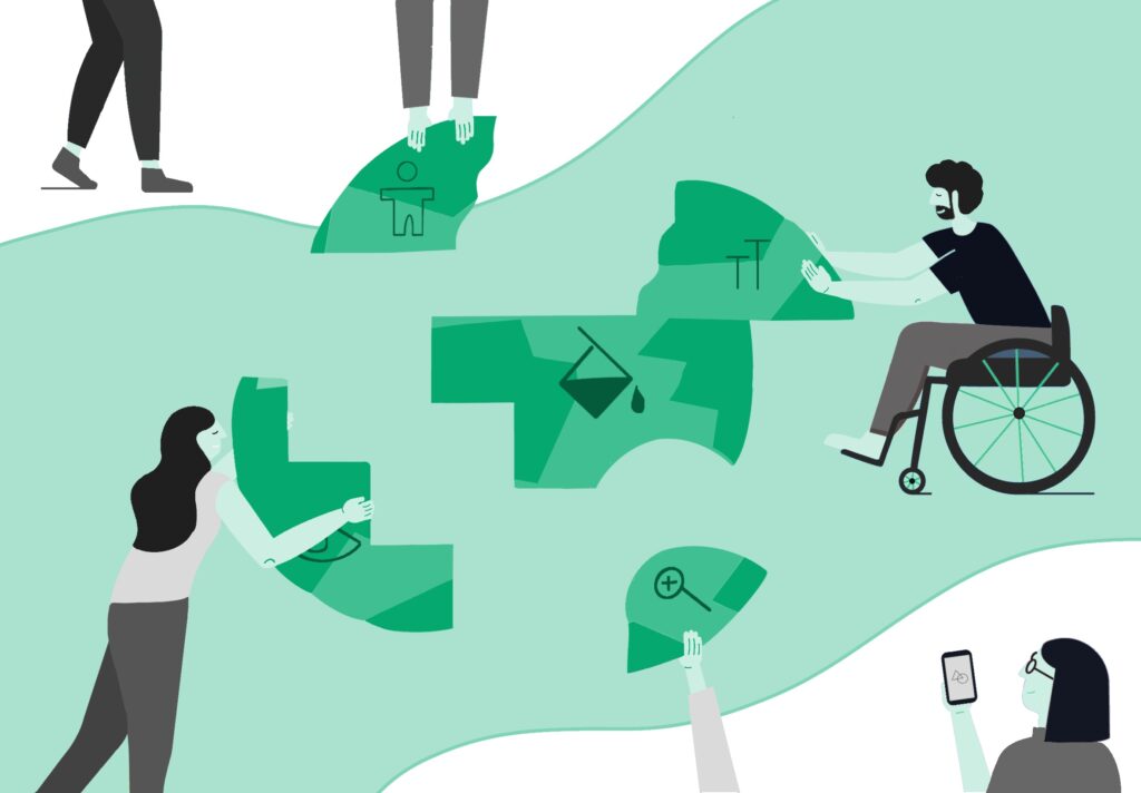
Most people wouldn’t argue against the fact that accessible design is important. When you exclude or provide a poor experience for people with disabilities, you not only degrade the value of your product you also widen the equity gap between non-disabled/neurotypical people and those with disabilities or neurodivergence. It’s not hard to understand why you’d want to avoid that.
But what’s often missed in these conversations is a broader view of the real impact of inclusive design. People sometimes think of it as an ethical box to check or something that can be put on the backburner to address later while you first design for the majority. It’s seen as a “nice to have” and not a core need. Some people assume it will be hard to implement and only help a fraction of users. But many don’t understand that accessible and inclusive design very often helps all of your users. We’ve also found it makes for better designers who become trained to think more broadly and carefully about user needs.
For the best-designed solutions, on any budget, accessibility can’t be an afterthought.
Accessibility vs. Inclusivity
Let’s pause and define accessibility and inclusivity in the design world.
Accessibility means designing for the needs of people with disabilities. For example, creating options for visually impaired people, Deaf/hard of hearing, or with mobility constraints. The idea here is that you want everyone to have equal access to your product.
Inclusivity, on the other hand, is a broader umbrella. This means designing not just for those with disabilities, but for the broader spectrum of differences inherent among people — for example, people in different environments (which could involve different weather, different WiFi access, different cultural expectations), different minds (which could include accounting for different ways people like to process information or motivate themselves to complete a task), or different identities (which could include using gender-neutral words when talking about bodies/health). Inclusive design can also mean designing for people with temporary disabilities (like a broken bone) or a situation that changes how they move through the world (like having your hands full). With inclusive design, the idea is that everyone is different and living life differently, and you want as many people as possible to use your product successfully in as many situations as possible.
Why Accessible and Inclusive Design Help Everyone
If you’re a non-disabled person who’s ever used subtitles, taken an escalator, using voice commands, or appreciated an automated door opening and closing for you, you’ve engaged in something that, while critical for someone with a disability, also helped you be more comfortable or safe. While this isn’t the case for every feature designed to accommodate people with disabilities, it often benefits others. Take the following example.
Case in Point: Icons for Fast Food Cashiers
Recently, a major fast-food establishment client came to us with a problem. They told us they were having trouble getting the correct information from cashiers/order-takers in the front of the restaurant to the cooks in the back of the house. These miscommunications resulted in a lot of wasted food, much of which had been cooked in excess due to misunderstandings about demand.
Our team investigated solutions and ultimately redesigned the order system; they considered differences among people that could affect their ability to use text-based buttons. What about non-native English speakers? What about those with reading difficulties? This led us to consider using icons for food prep communication, which bridged language/reading gaps while also helping those without such needs transmit and digest information quickly. And it worked — the company significantly reduced the amount of wasted food and lowered their overhead. Considering a variation in needs resulted in a better solution for everyone.
Contextualizing Disability
Something that can help contextualize why designing for differences helps everyone is the social model of disability. This model states that what creates disability are barriers in society — not inherent impairments or differences. In this helpful explainer video, they prompt you to consider a world in which everyone moves around using a wheelchair. Door sizes, ceiling heights, tables, and desks are all structured to best support this population. Then, some people walk instead of using a wheelchair to move around. The town does not accommodate them or their needs, and suddenly what we might consider an “able-bodied” person is the one limited by the design of this society. Essentially, “disability” would disappear in a society designed to accommodate differences.
And as we saw with the fast-food example, designing for difference doesn’t mean playing a game of edge-case whack-a-mole, which some product teams fear accessible design will be like. If you zoom out and think of a diverse array of people and the relevant angles of variance that inform how they’ll interact with your product, this often leads to elegant designs that support the needs of broader groups.
Inclusive Practices Make for Better Designers
After all this, it’s not hard to imagine how designing for accessibility and inclusion makes your design teams stronger. Thinking inclusively prompts you to contend with the complexity and nuance in people who are inherently not homogenous, even if they do not have a classified disability. It spurs creative problem solving and a design ethic that can be translated to anything they approach.
Want to learn how Grand Studio can help with your next project and build clarity out of complexity?
We’re here to help!
